
How to Measure Website Effectiveness
The 7 Dimension Scores Every Website UX Audit Should Measure

How to Measure Website Effectiveness
Digital Insights by
Senior Digital Consultant
Measure website effectiveness using a proven, research backed, 7 dimension UX Audit framework — from emotional connection and usability to navigation and CTA performance — to drive real business results.

📌 Executive Summary
A website’s success isn’t measured by speed, traffic, or technical performance alone — it’s measured by how effectively it helps users understand your offer, trust your brand, navigate seamlessly, and take meaningful action. Website effectiveness focuses on human experience, while performance focuses on machines and metrics.
The 7 Dimensions of Website Effectiveness
Emotional impact, usability & accessibility, USP clarity, language & tone, messaging hierarchy, CTA effectiveness, and navigation — provide a structured, research-backed framework to assess and improve your site.
Quick wins often come from refining your hero section, clarifying your USP, strengthening CTAs, and optimising navigation, creating immediate improvements in engagement, trust, and conversions.
Tracking these dimensions over time with a Website Effectiveness Score gives a clear, actionable view of your site’s strengths, weaknesses, and opportunities.
Most search results for “how to measure website effectiveness” focus on technical website performance: page speed, traffic analytics, bounce rate, Core Web Vitals, and SEO metrics. These are important — but they do not tell you whether your website is truly effective.
This is where a crucial distinction is often missed:
Website performance measures how well your website functions for search engines and technology.
Website effectiveness measures how well your website works for real users and your business.
Performance includes metrics like:
page loading speed
mobile responsiveness
SEO rankings
organic traffic
time on page
technical optimisation
These indicate how efficiently a website is delivered, crawled, and indexed.
Effectiveness, however, focuses on outcomes such as:
clarity of your message
user understanding and engagement
trust and credibility
ease of navigation
conversion rates
enquiries, leads, and sales
In other words:
Performance gets users to your website.
Effectiveness determines what happens on your website.
A fast, technically optimised website can still fail if users can’t understand what you do, don’t feel confident, or can’t find what they need. Measuring effectiveness requires assessing the human experience — not just the technical one. Read more about human based website UX audits.
🟢 QUICK ANSWER: How do you measure website effectiveness?
You measure website effectiveness by evaluating how well the site helps users understand, navigate, trust, and take action. This is best done with a multi-dimensional UX framework that scores emotional impact, clarity, usability, messaging, CTAs, and navigation.

What Is Website Effectiveness?
🟢 QUICK ANSWER: What is Website Effectiveness?
Website effectiveness is a measure of how well a website helps real users achieve their goals and take meaningful action — such as understanding your offer, feeling trust, navigating easily, and converting into enquiries, leads, or sales.
Unlike website performance (speed, SEO, traffic), website effectiveness focuses on the quality of the user experience and how successfully the site communicates, guides, persuades, and supports decision-making.
That’s why we use the Leadzea 7 Dimensions: a structured, human-centred framework for evaluating whether a website is truly effective in delivering clarity, trust, usability, persuasion, and ultimately business results.
Website Performance vs Website Effectiveness
Website Performance | Website Effectiveness |
|---|---|
Measures technical function | Measures user experience & outcomes |
Focused on machines (Google, browsers) | Focused on humans (visitors, customers) |
Page speed & load times | Clarity of message & value proposition |
Core Web Vitals | Trust, credibility & emotional impact |
SEO ranking & crawlability | Navigation, usability & task completion |
Traffic volume & sessions | Engagement, enquiries, leads & sales |
Technical optimisation | Conversion optimisation |
Helps people reach the site | Helps people do something on the site |
Performance gets visitors onto your website; effectiveness determines what they understand, feel, and ultimately decide to do.
In today’s hyper-competitive digital landscape, a website isn’t just a brochure — it’s the frontline of your brand, lead generation and conversion engine. But how do you know if your site is truly effective?
Technical evaluation tools are necessary to meet the needs of the machines, however our prospects and customers aren't algorithms - they're people.
A standard web assessment can’t just measure site speed, traffic or page views; you need a multi-dimensional scorecard to evaluate how people feel, interact and convert on your site.
🟢 QUICK ANSWER: What is the difference between website performance and website effectiveness
Website performance refers to technical metrics like speed, SEO, and stability. Website effectiveness focuses on user experience, clarity, behaviour, and conversion outcomes.
The 7 Dimensions of Website Effectiveness
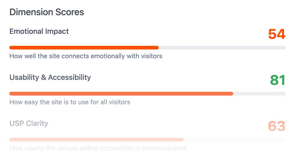
Leadzea is a dedicated app for web designers and creative agencies that uses the seven key dimension scores, which form a comprehensive picture of website effectiveness. Below, we unpack each dimension, explain why it matters (backed by leading research), and offer practical ways to measure and improve.
Understanding the importance of the 7 dimension scores is fundamental in measuring effectiveness in user testing, applying KPI's during the design stage, and as a fact based conversation starter when reaching out to new web design leads. Learn how to get more web design clients using inbound, outreach and hybrid strategies.
❤️ 1. Emotional Impact
What it measures: The degree to which your website evokes positive feelings — trust, delight, belonging — that make people stay, engage, or convert.
Why it matters: Emotional design is more than aesthetics. According to design theory from Don Norman (co-founder of the Nielsen Norman Group), people form emotional connections with products (and websites) on visceral, behavioural, and reflective levels. wikipedia
A compelling emotional experience can increase user satisfaction and retention: for example, research shows that emotionally resonant design can boost product retention significantly. moldStud
Also, the “aesthetic–usability effect” suggests that users perceive more visually pleasing designs as more usable — increasing their trust and likelihood to engage. wikipedia
People make decisions emotionally first, then justify logically
How to measure (KPIs):
Conduct usability testing with emotional feedback: ask testers how the site makes them feel using standardised scales (e.g., “friendly,” “trustworthy,” “exciting”).
Track return-visitor rates, session duration, and bounce rate as indirect indicators of emotional resonance.
Use Net Promoter Score (NPS) or survey users about their emotional reaction to your site.
How to improve:
Introduce friendly, human-centered microcopy and imagery (people, stories, relatable context).
Add trust signals: testimonials, client logos, real-world proof.
Use subtle micro-animations or feedback moments (e.g., button hover, confirmations) to delight and reassure.
🟢 QUICK ANSWER: Why does emotional impact matter in website effectiveness?
Emotional impact shapes first impressions and trust. Users decide within seconds whether to stay or leave, and positive emotional responses greatly increase engagement and conversions.
♿ 2. Usability & Accessibility
What it measures: How easy it is for everyone — including people with disabilities — to use your website.
Why it matters: Poor usability or accessibility is a major barrier to conversion, and it also excludes large audiences. WebAIM’s “Million” project analyzed the top one million homepages, finding an average of 56.8 accessibility errors per page in its 2024 study. webaim.org
Moreover, 95.9% of sites had at least one WCAG (Web Content Accessibility Guidelines) conformance failure. webaim.org
These issues aren’t just ethical — they affect real business performance. Ensuring usability and accessibility means fewer frustrated users, lower drop-off, and broader reach.
How to measure (KPIs):
Run automated accessibility audits (e.g., using tools like WAVE, Axe) to identify WCAG violations.
Do manual accessibility testing, including keyboard-only navigation and screen-reader testing.
Conduct usability tests, measuring task success rate, time-on-task, and error rate.
How to improve:
Prioritize and fix the most common errors: alt text, form labels, color contrast, heading semantics.
Ensure keyboard focus states are clear and usable.
Use accessibility as part of QA (quality assurance), not just a one-time audit.
💡 3. USP Clarity (Unique Selling Proposition)
What it measures: How clearly and quickly your site communicates why someone should choose you — what you do, who you serve, and what makes you different.
Why it matters: Web visitors decide fast. Research from usability experts shows that people scan pages in seconds. If your USP isn’t immediately clear, they may bounce.
Nielsen Norman Group’s reading-pattern research demonstrates that people often read in an “F-shaped” pattern — meaning the most important information needs to be front-loaded and easily scannable. guides.libraries.wm.edu+1
Without a clear USP, you risk confusing users, increasing bounce rate, and losing potential conversions.
How to measure (KPIs):
Run quick usability or micro-testing: ask users within 5–10 seconds what they think your business offers.
Measure bounce rate on landing/hero pages.
Track click-through from the hero section to next-step pages (e.g., product pages, sign-up).
How to improve:
Simplify your hero headline: one clear sentence of primary benefit.
Add a supporting sub-head or bullet list that states specific proof points or differentiators.
Use concrete, benefit-focused language (e.g., “Save 20 hours per week,” “Trusted by 500+ businesses”).
Pro Tip: When discussing website design with clients, ask them about their USP. You'll be surprised at how many business owners struggle to answer the question. The question positions you as a strategist - not just another creative.
✍️ 4. Language & Tone
What it measures: Whether your messaging uses the right voice, tone, and readability for your target audience.
Why it matters: Your choice of words directly impacts how visitors perceive your brand and whether they feel understood. According to web content research, 79% of users scan rather than read word-for-word. Newcastle University
Using active voice, short sentences, and a tone that resonates with your audience greatly improves comprehension and engagement.
How to measure (KPIs):
Evaluate readability using tools like Flesch–Kincaid or other grade-level metrics, comparing them to the target audience’s reading level.
Run A/B tests on key pages with different tonal variants (e.g., formal vs conversational).
Analyse help-desk or user feedback to see where language causes confusion or friction.
How to improve:
Write in plain, active language; avoid jargon unless your audience demands it.
Use bullets, bolding, and subheads to surface benefits for scannable reading.
Align tone with your brand persona — ask: does this sound like a trusted expert, a friendly guide, or a visionary innovator?
Pro Tip: Modifying a title from 'what you do' to 'how you help' can significantly improve engagement.
📑 5. Messaging Hierarchy
What it measures: How well your site organises and prioritises information by importance — do visitors see your key messages, benefits, and CTAs where they instinctively look?
Why it matters: Not all parts of a webpage are equal. Based on Nielsen Norman Group’s eye-tracking studies, users follow F-shaped scanning, meaning they first read horizontally across the top, then partially lower across, then scan vertically down the left. guides.libraries.wm.edu+1
If your most critical content or call to action isn’t positioned to align with that natural scan path, many users may never see it.
How to measure (KPIs):
Use heat-maps or scroll-depth analytics to see where users focus and how far they scroll.
Measure % of users who reach your CTA or key message areas.
Track time-to-first-action to see how quickly visitors engage with your main message.
How to improve:
Place headline, key benefits, and CTA in the top-left or “hero zone” where eyes naturally go.
Use visual contrast, whitespace, and layout to separate and emphasise hierarchy: eg. subheads, bullet lists.
Test a simplified page layout that front-loads your most important content and removes distractions.
🎯 6. CTA (Call-to-Action) Effectiveness
What it measures: The visibility, clarity, and persuasiveness of your calls-to-action — whether people notice them, understand them, and click them.
Why it matters: Even a beautifully designed site fails if visitors don’t know what to do next. That’s where CTA effectiveness becomes a conversion lever.
According to HubSpot’s analysis of more than 330,000 CTAs, personalised calls-to-action convert 202% better than generic ones. HubSpot Blog
A strong CTA isn’t just about design — it’s about relevance and resonance.
How to measure (KPIs):
Click-through rate (CTR) of your CTA buttons, broken down by page and device.
Conversion rate after CTA click (micro and macro conversions).
Performance of A/B tests on different CTA copy, size, colour, placement, and personalisation.
How to improve:
Use outcome-focused, benefit-oriented copy (e.g., “Start my audit” vs “Contact”).
Ensure your CTA is visible above the fold, and repeat it if the page is long.
Personalise CTAs based on visitor context: new vs returning, referral source, geography.
Pro Tip: If all of the CTA's on a site say 'Contact Us', it needs a rethink.
📍 Related: My in-depth article on how to get web design clients covers the benefits of value-led language and CTA's.
🧭 7. Navigation
What it measures: How intuitive and friction-free your site structure is — how easily people find what they’re looking for.
Why it matters: Poor navigation drives frustration, drop-offs, and high bounce or abandonment rates. For example, Baymard Institute’s checkout UX research shows that navigation issues (including findability) contribute to cart abandonment — their benchmark for e-commerce abandonment is around 70.19%. Baymard Institute+1
When users can’t find what they need, or the structure isn't intuitive, they leave — even if your value proposition is strong.
How to measure (KPIs):
Run “find-it” usability tests: ask users to locate specific pages (e.g., pricing, contact) and measure success/error rate.
Analyse click depth (how many clicks needed to reach key pages) in site analytics.
Monitor exit pages, especially if they’re top-level navigation items, and identify “no result” searches on your site’s search function.
How to improve:
Simplify your information architecture: flatten deep hierarchies, reduce clicks to key pages.
Make search prominent, intelligent, and forgiving (autosuggest, synonyms).
Use breadcrumbs, consistent menu structures, and contextual menus to help users stay oriented.
Pro Tip: B2C site traffic will be predominantly mobile. Use filter and sort buttons to make choosing easier. Search fields and anything that relies on 'typing' is best avoided.
Bringing It All Together: Your Website Effectiveness Score
To capture a holistic view of your site’s performance, you can:
Normalise each dimension score (e.g., on a 0–100 scale).
Weight each dimension according to your business goals (for example: CTA effectiveness 20%, Usability & Accessibility 18%, Navigation 15%, USP clarity 15%, Messaging Hierarchy 12%, Emotional Impact 30%, Language & Tone 10%).
Calculate a composite “Website Effectiveness Score” as a weighted average.
Report a confidence interval (±) if some metrics are based on qualitative or usability testing data.
This overall score gives you a single, actionable metric you can track over time — but the power lies in the individual dimension scores, which point to where the biggest opportunities lie.
Take a look at my Free Website Growth Audit.
Find out how your website scores in less than 30 seconds.

🟢 QUICK ANSWER: What is a Website Effectiveness Score?
A Website Effectiveness Score is a combined rating based on multiple user-experience dimensions — such as clarity, usability, emotional impact, messaging, navigation, and conversion strength — giving you one metric to track over time.
Quick Action Plan: Prioritise High-Impact Fixes
If you’re looking to boost effectiveness fast, here are some tactical wins that often move the needle:
Refine your hero area — make USP and CTA crystal clear. Target smiles :-)
Run an accessibility audit and fix the most common WCAG issues (alt text, contrast, forms).
Improve CTA copy and placement, and personalise when possible.
Reorganise page sections to align with F-pattern reading — front-load benefits, use bolds and bullets.
Introduce emotional triggers (microcopy, trust cues, human imagery) to build connection.
Why The 7 Dimension Scores Matter
This seven-dimension framework is not theoretical — it reflects how real people interact with your website. By measuring and improving across all these areas, you are not just optimising for clicks, but for meaningful engagement, trust, and conversion.
Emotion + clarity = trust + relevance
Usability + accessibility = inclusivity + fewer barriers
Hierarchy + navigation = efficient user journeys
CTA focus = clear next steps
Applying this scorecard to your clients’ sites (or your own) can transform vague UX feedback into concrete, data-informed optimisation steps — and deliver measurable business outcomes.
Frequently Asked Questions About Measuring Website Effectiveness and UX Audit Processes
What is website effectiveness?
Website effectiveness measures how well a website achieves its goals — from communicating value and building trust to guiding users to take action. It looks beyond speed or technical performance to include emotional impact, usability, clarity, and conversion-driving design.
Is website effectiveness the same as website performance?
No. Website performance covers technical aspects like page speed, SEO, and uptime. Website effectiveness focuses on how users understand, navigate, trust, and interact with your site to complete goals. Performance brings users to the site; effectiveness determines what they do next.
How do you measure the effectiveness of a website?
You measure website effectiveness by evaluating key UX dimensions: emotional impact, USP clarity, messaging hierarchy, usability, navigation, CTA performance, and tone/language. Combining scores across these dimensions — often using a website UX audit — provides a holistic view of user experience and business outcomes.
How can you quantify website effectiveness?
Website effectiveness can be quantified by scoring each UX dimension on a normalized scale (e.g., 0–100) and weighting areas according to business priorities. This composite score — often generated through a website UX audit tool — helps track improvements over time.
What metrics best indicate effective user experience?
Beyond traffic and bounce rates, key metrics include task completion rates, conversion rates, time on task, engagement, return visits, emotional feedback (e.g., surveys or NPS), and errors during usability testing. These metrics reveal whether users can achieve their goals efficiently.
Are analytics alone enough to measure effectiveness?
No. Analytics show what users do, but not why. True effectiveness measurement combines analytics with human-centred methods, like usability testing, website UX audits, and emotional feedback, to uncover barriers and behaviour patterns.
Can website effectiveness be improved without redesigning the site?
Yes. Many improvements are simple yet impactful: clarifying your USP, improving CTA placement, refining messaging hierarchy, or fixing navigation issues can boost engagement and conversions without a full redesign.
How do you prioritise which UX issues to fix first?
Focus on friction points that block users from understanding your offer, trusting your brand, or completing actions. Website usability audits and analytics can help identify the highest-impact areas.
What’s the quickest way to improve a website’s effectiveness?
Start by optimising the hero section, clarifying your USP, and strengthening your CTAs. These areas drive first impressions, clarity, and action — the most powerful levers for immediate improvement.
Can improving one dimension really improve overall performance?
Yes. Fixing a single high-friction area, such as CTA visibility or messaging clarity, often lifts conversions and engagement significantly.
Can a high 'performing' website fail at effectiveness?
Absolutely. A website can load fast, rank well, and attract traffic, yet fail to convert if users don’t understand the message, trust the brand, or navigate smoothly.
Why is emotional impact important on a website?
Emotional impact shapes first impressions, builds trust, and influences engagement. Websites that feel confident and credible encourage visitors to explore and take action.
How do emotional impact and trust affect website effectiveness?
Visitors make decisions emotionally before rationalising them. When users feel connected to your brand, they stay longer, engage more, and convert at higher rates.
What is a USP and why does it matter for website effectiveness?
A USP (Unique Selling Proposition) explains why your business is different and valuable. If it isn’t clear, users may leave quickly. A strong USP reduces bounce rates and boosts conversions.
Why is a clear USP critical for website success?
A clear USP communicates your value proposition immediately. It improves clarity, engagement, and trust — all essential elements of website effectiveness.
How does language and tone influence website effectiveness?
Clear, concise, and audience-appropriate language improves comprehension, trust, and engagement. Misaligned tone or jargon confuses users, increases bounce rates, and reduces conversions.
How can I tell if my website’s navigation is effective?
Navigation works when users reach key pages quickly and without frustration. Long paths, high exit rates, or failed searches indicate issues. Evaluating navigation is a key part of any website usability audit.
How does navigation influence conversions?
Intuitive menus and clear paths improve task completion and engagement. Confusing structures frustrate visitors and increase drop-offs, directly impacting conversion rates.
How do I know if my website’s messaging hierarchy is clear?
A clear hierarchy presents the most important information first, flowing naturally to supporting content. Users should understand your offer, value, and next steps at a glance.
What makes a call-to-action (CTA) effective?
Effective CTAs are visible, use clear action-oriented language, and connect to a desirable outcome. They reduce friction, guide users, and drive conversions.
How do you measure the effectiveness of CTAs specifically?
Track click-through and conversion rates, run A/B tests on copy, placement, or design, and observe user flow after CTA engagement. Contextual outcomes — like form submissions or purchases — reveal true effectiveness.
How does usability differ from accessibility?
Usability measures how easily a website can be used by average visitors. Accessibility ensures the site is usable by people with disabilities. Both are essential for reducing friction and improving engagement.
Is website usability the same as effectiveness?
Not exactly. Usability is one part of effectiveness. A usable site may still fail to communicate your value, inspire trust, or drive conversions.
How do I conduct a website usability audit?
A website usability audit evaluates navigation, readability, messaging flow, and task completion. It often combines observation, task-based testing, and scoring to prioritise improvements.
What should be included in a website usability checklist?
A comprehensive website usability checklist covers accessibility, navigation clarity, messaging hierarchy, CTA visibility, readability, and responsiveness, ensuring the site is easy to use and supports conversions.
What is a website UX audit and why is it important?
A website UX audit evaluates user experience across multiple dimensions — usability, messaging clarity, CTA effectiveness, and navigation — to identify friction points and opportunities for improvement.
What is the best website UX audit checklist?
The best checklist is multidimensional, scoring emotional impact, usability, USP clarity, messaging hierarchy, CTA effectiveness, navigation, and language/tone — for a holistic view of user experience and business outcomes.
How does a website UX audit tool help optimise conversions?
A website UX audit tool tracks user flows, task completion, and interface issues. By scoring emotional impact, clarity, and usability, it prioritises improvements that increase engagement and conversions.
Do website UX audits include accessibility testing?
Yes. Accessibility testing is part of a thorough website UX audit, ensuring all visitors can navigate and interact with the site effectively.
Can a website audit tool measure effectiveness?
Some website audit tools track technical performance and surface usability issues, but full website effectiveness measurement requires combining automated insights with human-centred testing and emotional feedback.
What is the best framework for evaluating a website?
A multi-dimensional framework, like Leadzea’s 7 Dimensions, scores emotional impact, messaging clarity, usability, navigation, CTA effectiveness, and language/tone — providing a more accurate assessment than metrics alone.
How do I start user testing on my website?
Define clear objectives and tasks, then use a structured framework — like Leadzea’s 7 Dimension scores — to assess clarity, navigation, usability, emotional impact, and CTA performance.
What’s the best way to make user testing actionable?
Observe how users complete tasks, where they hesitate, and which areas cause confusion. Map results to UX dimensions to prioritise changes that improve engagement and conversions.
Can a user testing task be too arbitrary (like buying a teddy bear)?
Yes — unless it’s fun! Focus on meaningful scenarios aligned with your website goals. Using Leadzea’s 7 Dimension scores gives a better starting point than “can you buy the teddy bear?” for tasks that truly test effectiveness.
Can an automated algorithmic process measure website effectiveness?
Not fully. Tools can track performance and surface usability issues, but emotional impact, comprehension, and decision-making still require human-centred research.
How often should a website be evaluated or audited?
Websites should be audited every 6–12 months. Regular website UX audits or website usability audits keep your site aligned with goals, user expectations, and competitor activity.
What's the biggest UI mistake you see as a senior consultant?
Making users rely on search boxes or typing on mobile. Large data sets should be filterable and sortable with simple, tappable buttons.
Conclusion
A truly effective website isn’t measured by traffic or technicalities alone — it’s measured by how well it connects, guides, and converts. By tracking the seven dimension scores in your Leadzea assessment, you get a balanced, research-backed view of your site’s strengths and gaps.
Use those insights to drive prioritised improvements, and you’ll see not just more time on site, but more meaningful results.
Written by Lee Darius, Senior Digital Consultant. Lee helps businesses optimise websites and improve user experience to drive real results. Learn more on Lee’s Digital Consultant page.
How to Measure Website Effectiveness
The 7 Dimension Scores Every Website UX Audit Should Measure
How to Measure Website Effectiveness
Digital Insights by
Senior Digital Consultant
Measure website effectiveness using a proven, research backed, 7 dimension UX Audit framework — from emotional connection and usability to navigation and CTA performance — to drive real business results.
📌 Executive Summary
A website’s success isn’t measured by speed, traffic, or technical performance alone — it’s measured by how effectively it helps users understand your offer, trust your brand, navigate seamlessly, and take meaningful action. Website effectiveness focuses on human experience, while performance focuses on machines and metrics.
The 7 Dimensions of Website Effectiveness
Emotional impact, usability & accessibility, USP clarity, language & tone, messaging hierarchy, CTA effectiveness, and navigation — provide a structured, research-backed framework to assess and improve your site.
Quick wins often come from refining your hero section, clarifying your USP, strengthening CTAs, and optimising navigation, creating immediate improvements in engagement, trust, and conversions.
Tracking these dimensions over time with a Website Effectiveness Score gives a clear, actionable view of your site’s strengths, weaknesses, and opportunities.
Most search results for “how to measure website effectiveness” focus on technical website performance: page speed, traffic analytics, bounce rate, Core Web Vitals, and SEO metrics. These are important — but they do not tell you whether your website is truly effective.
This is where a crucial distinction is often missed:
Website performance measures how well your website functions for search engines and technology.
Website effectiveness measures how well your website works for real users and your business.
Performance includes metrics like:
page loading speed
mobile responsiveness
SEO rankings
organic traffic
time on page
technical optimisation
These indicate how efficiently a website is delivered, crawled, and indexed.
Effectiveness, however, focuses on outcomes such as:
clarity of your message
user understanding and engagement
trust and credibility
ease of navigation
conversion rates
enquiries, leads, and sales
In other words:
Performance gets users to your website.
Effectiveness determines what happens on your website.
A fast, technically optimised website can still fail if users can’t understand what you do, don’t feel confident, or can’t find what they need. Measuring effectiveness requires assessing the human experience — not just the technical one. Read more about human based website UX audits.
🟢 QUICK ANSWER: How do you measure website effectiveness?
You measure website effectiveness by evaluating how well the site helps users understand, navigate, trust, and take action. This is best done with a multi-dimensional UX framework that scores emotional impact, clarity, usability, messaging, CTAs, and navigation.
What Is Website Effectiveness?
🟢 QUICK ANSWER: What is Website Effectiveness?
Website effectiveness is a measure of how well a website helps real users achieve their goals and take meaningful action — such as understanding your offer, feeling trust, navigating easily, and converting into enquiries, leads, or sales.
Unlike website performance (speed, SEO, traffic), website effectiveness focuses on the quality of the user experience and how successfully the site communicates, guides, persuades, and supports decision-making.
That’s why we use the Leadzea 7 Dimensions: a structured, human-centred framework for evaluating whether a website is truly effective in delivering clarity, trust, usability, persuasion, and ultimately business results.
Website Performance vs Website Effectiveness
Website Performance | Website Effectiveness |
|---|---|
Measures technical function | Measures user experience & outcomes |
Focused on machines (Google, browsers) | Focused on humans (visitors, customers) |
Page speed & load times | Clarity of message & value proposition |
Core Web Vitals | Trust, credibility & emotional impact |
SEO ranking & crawlability | Navigation, usability & task completion |
Traffic volume & sessions | Engagement, enquiries, leads & sales |
Technical optimisation | Conversion optimisation |
Helps people reach the site | Helps people do something on the site |
Performance gets visitors onto your website; effectiveness determines what they understand, feel, and ultimately decide to do.
In today’s hyper-competitive digital landscape, a website isn’t just a brochure — it’s the frontline of your brand, lead generation and conversion engine. But how do you know if your site is truly effective?
Technical evaluation tools are necessary to meet the needs of the machines, however our prospects and customers aren't algorithms - they're people.
A standard web assessment can’t just measure site speed, traffic or page views; you need a multi-dimensional scorecard to evaluate how people feel, interact and convert on your site.
🟢 QUICK ANSWER: What is the difference between website performance and website effectiveness
Website performance refers to technical metrics like speed, SEO, and stability. Website effectiveness focuses on user experience, clarity, behaviour, and conversion outcomes.
The 7 Dimensions of Website Effectiveness
Leadzea is a dedicated app for web designers and creative agencies that uses the seven key dimension scores, which form a comprehensive picture of website effectiveness. Below, we unpack each dimension, explain why it matters (backed by leading research), and offer practical ways to measure and improve.
Understanding the importance of the 7 dimension scores is fundamental in measuring effectiveness in user testing, applying KPI's during the design stage, and as a fact based conversation starter when reaching out to new web design leads. Learn how to get more web design clients using inbound, outreach and hybrid strategies.
❤️ 1. Emotional Impact
What it measures: The degree to which your website evokes positive feelings — trust, delight, belonging — that make people stay, engage, or convert.
Why it matters: Emotional design is more than aesthetics. According to design theory from Don Norman (co-founder of the Nielsen Norman Group), people form emotional connections with products (and websites) on visceral, behavioural, and reflective levels. wikipedia
A compelling emotional experience can increase user satisfaction and retention: for example, research shows that emotionally resonant design can boost product retention significantly. moldStud
Also, the “aesthetic–usability effect” suggests that users perceive more visually pleasing designs as more usable — increasing their trust and likelihood to engage. wikipedia
People make decisions emotionally first, then justify logically
How to measure (KPIs):
Conduct usability testing with emotional feedback: ask testers how the site makes them feel using standardised scales (e.g., “friendly,” “trustworthy,” “exciting”).
Track return-visitor rates, session duration, and bounce rate as indirect indicators of emotional resonance.
Use Net Promoter Score (NPS) or survey users about their emotional reaction to your site.
How to improve:
Introduce friendly, human-centered microcopy and imagery (people, stories, relatable context).
Add trust signals: testimonials, client logos, real-world proof.
Use subtle micro-animations or feedback moments (e.g., button hover, confirmations) to delight and reassure.
🟢 QUICK ANSWER: Why does emotional impact matter in website effectiveness?
Emotional impact shapes first impressions and trust. Users decide within seconds whether to stay or leave, and positive emotional responses greatly increase engagement and conversions.
♿ 2. Usability & Accessibility
What it measures: How easy it is for everyone — including people with disabilities — to use your website.
Why it matters: Poor usability or accessibility is a major barrier to conversion, and it also excludes large audiences. WebAIM’s “Million” project analyzed the top one million homepages, finding an average of 56.8 accessibility errors per page in its 2024 study. webaim.org
Moreover, 95.9% of sites had at least one WCAG (Web Content Accessibility Guidelines) conformance failure. webaim.org
These issues aren’t just ethical — they affect real business performance. Ensuring usability and accessibility means fewer frustrated users, lower drop-off, and broader reach.
How to measure (KPIs):
Run automated accessibility audits (e.g., using tools like WAVE, Axe) to identify WCAG violations.
Do manual accessibility testing, including keyboard-only navigation and screen-reader testing.
Conduct usability tests, measuring task success rate, time-on-task, and error rate.
How to improve:
Prioritize and fix the most common errors: alt text, form labels, color contrast, heading semantics.
Ensure keyboard focus states are clear and usable.
Use accessibility as part of QA (quality assurance), not just a one-time audit.
💡 3. USP Clarity (Unique Selling Proposition)
What it measures: How clearly and quickly your site communicates why someone should choose you — what you do, who you serve, and what makes you different.
Why it matters: Web visitors decide fast. Research from usability experts shows that people scan pages in seconds. If your USP isn’t immediately clear, they may bounce.
Nielsen Norman Group’s reading-pattern research demonstrates that people often read in an “F-shaped” pattern — meaning the most important information needs to be front-loaded and easily scannable. guides.libraries.wm.edu+1
Without a clear USP, you risk confusing users, increasing bounce rate, and losing potential conversions.
How to measure (KPIs):
Run quick usability or micro-testing: ask users within 5–10 seconds what they think your business offers.
Measure bounce rate on landing/hero pages.
Track click-through from the hero section to next-step pages (e.g., product pages, sign-up).
How to improve:
Simplify your hero headline: one clear sentence of primary benefit.
Add a supporting sub-head or bullet list that states specific proof points or differentiators.
Use concrete, benefit-focused language (e.g., “Save 20 hours per week,” “Trusted by 500+ businesses”).
Pro Tip: When discussing website design with clients, ask them about their USP. You'll be surprised at how many business owners struggle to answer the question. The question positions you as a strategist - not just another creative.
✍️ 4. Language & Tone
What it measures: Whether your messaging uses the right voice, tone, and readability for your target audience.
Why it matters: Your choice of words directly impacts how visitors perceive your brand and whether they feel understood. According to web content research, 79% of users scan rather than read word-for-word. Newcastle University
Using active voice, short sentences, and a tone that resonates with your audience greatly improves comprehension and engagement.
How to measure (KPIs):
Evaluate readability using tools like Flesch–Kincaid or other grade-level metrics, comparing them to the target audience’s reading level.
Run A/B tests on key pages with different tonal variants (e.g., formal vs conversational).
Analyse help-desk or user feedback to see where language causes confusion or friction.
How to improve:
Write in plain, active language; avoid jargon unless your audience demands it.
Use bullets, bolding, and subheads to surface benefits for scannable reading.
Align tone with your brand persona — ask: does this sound like a trusted expert, a friendly guide, or a visionary innovator?
Pro Tip: Modifying a title from 'what you do' to 'how you help' can significantly improve engagement.
📑 5. Messaging Hierarchy
What it measures: How well your site organises and prioritises information by importance — do visitors see your key messages, benefits, and CTAs where they instinctively look?
Why it matters: Not all parts of a webpage are equal. Based on Nielsen Norman Group’s eye-tracking studies, users follow F-shaped scanning, meaning they first read horizontally across the top, then partially lower across, then scan vertically down the left. guides.libraries.wm.edu+1
If your most critical content or call to action isn’t positioned to align with that natural scan path, many users may never see it.
How to measure (KPIs):
Use heat-maps or scroll-depth analytics to see where users focus and how far they scroll.
Measure % of users who reach your CTA or key message areas.
Track time-to-first-action to see how quickly visitors engage with your main message.
How to improve:
Place headline, key benefits, and CTA in the top-left or “hero zone” where eyes naturally go.
Use visual contrast, whitespace, and layout to separate and emphasise hierarchy: eg. subheads, bullet lists.
Test a simplified page layout that front-loads your most important content and removes distractions.
🎯 6. CTA (Call-to-Action) Effectiveness
What it measures: The visibility, clarity, and persuasiveness of your calls-to-action — whether people notice them, understand them, and click them.
Why it matters: Even a beautifully designed site fails if visitors don’t know what to do next. That’s where CTA effectiveness becomes a conversion lever.
According to HubSpot’s analysis of more than 330,000 CTAs, personalised calls-to-action convert 202% better than generic ones. HubSpot Blog
A strong CTA isn’t just about design — it’s about relevance and resonance.
How to measure (KPIs):
Click-through rate (CTR) of your CTA buttons, broken down by page and device.
Conversion rate after CTA click (micro and macro conversions).
Performance of A/B tests on different CTA copy, size, colour, placement, and personalisation.
How to improve:
Use outcome-focused, benefit-oriented copy (e.g., “Start my audit” vs “Contact”).
Ensure your CTA is visible above the fold, and repeat it if the page is long.
Personalise CTAs based on visitor context: new vs returning, referral source, geography.
Pro Tip: If all of the CTA's on a site say 'Contact Us', it needs a rethink.
📍 Related: My in-depth article on how to get web design clients covers the benefits of value-led language and CTA's.
🧭 7. Navigation
What it measures: How intuitive and friction-free your site structure is — how easily people find what they’re looking for.
Why it matters: Poor navigation drives frustration, drop-offs, and high bounce or abandonment rates. For example, Baymard Institute’s checkout UX research shows that navigation issues (including findability) contribute to cart abandonment — their benchmark for e-commerce abandonment is around 70.19%. Baymard Institute+1
When users can’t find what they need, or the structure isn't intuitive, they leave — even if your value proposition is strong.
How to measure (KPIs):
Run “find-it” usability tests: ask users to locate specific pages (e.g., pricing, contact) and measure success/error rate.
Analyse click depth (how many clicks needed to reach key pages) in site analytics.
Monitor exit pages, especially if they’re top-level navigation items, and identify “no result” searches on your site’s search function.
How to improve:
Simplify your information architecture: flatten deep hierarchies, reduce clicks to key pages.
Make search prominent, intelligent, and forgiving (autosuggest, synonyms).
Use breadcrumbs, consistent menu structures, and contextual menus to help users stay oriented.
Pro Tip: B2C site traffic will be predominantly mobile. Use filter and sort buttons to make choosing easier. Search fields and anything that relies on 'typing' is best avoided.
Bringing It All Together: Your Website Effectiveness Score
To capture a holistic view of your site’s performance, you can:
Normalise each dimension score (e.g., on a 0–100 scale).
Weight each dimension according to your business goals (for example: CTA effectiveness 20%, Usability & Accessibility 18%, Navigation 15%, USP clarity 15%, Messaging Hierarchy 12%, Emotional Impact 30%, Language & Tone 10%).
Calculate a composite “Website Effectiveness Score” as a weighted average.
Report a confidence interval (±) if some metrics are based on qualitative or usability testing data.
This overall score gives you a single, actionable metric you can track over time — but the power lies in the individual dimension scores, which point to where the biggest opportunities lie.
Take a look at my Free Website Growth Audit.
Find out how your website scores in less than 30 seconds.
🟢 QUICK ANSWER: What is a Website Effectiveness Score?
A Website Effectiveness Score is a combined rating based on multiple user-experience dimensions — such as clarity, usability, emotional impact, messaging, navigation, and conversion strength — giving you one metric to track over time.
Quick Action Plan: Prioritise High-Impact Fixes
If you’re looking to boost effectiveness fast, here are some tactical wins that often move the needle:
Refine your hero area — make USP and CTA crystal clear. Target smiles :-)
Run an accessibility audit and fix the most common WCAG issues (alt text, contrast, forms).
Improve CTA copy and placement, and personalise when possible.
Reorganise page sections to align with F-pattern reading — front-load benefits, use bolds and bullets.
Introduce emotional triggers (microcopy, trust cues, human imagery) to build connection.
Why The 7 Dimension Scores Matter
This seven-dimension framework is not theoretical — it reflects how real people interact with your website. By measuring and improving across all these areas, you are not just optimising for clicks, but for meaningful engagement, trust, and conversion.
Emotion + clarity = trust + relevance
Usability + accessibility = inclusivity + fewer barriers
Hierarchy + navigation = efficient user journeys
CTA focus = clear next steps
Applying this scorecard to your clients’ sites (or your own) can transform vague UX feedback into concrete, data-informed optimisation steps — and deliver measurable business outcomes.
Frequently Asked Questions About Measuring Website Effectiveness and UX Audit Processes
What is website effectiveness?
Website effectiveness measures how well a website achieves its goals — from communicating value and building trust to guiding users to take action. It looks beyond speed or technical performance to include emotional impact, usability, clarity, and conversion-driving design.
Is website effectiveness the same as website performance?
No. Website performance covers technical aspects like page speed, SEO, and uptime. Website effectiveness focuses on how users understand, navigate, trust, and interact with your site to complete goals. Performance brings users to the site; effectiveness determines what they do next.
How do you measure the effectiveness of a website?
You measure website effectiveness by evaluating key UX dimensions: emotional impact, USP clarity, messaging hierarchy, usability, navigation, CTA performance, and tone/language. Combining scores across these dimensions — often using a website UX audit — provides a holistic view of user experience and business outcomes.
How can you quantify website effectiveness?
Website effectiveness can be quantified by scoring each UX dimension on a normalized scale (e.g., 0–100) and weighting areas according to business priorities. This composite score — often generated through a website UX audit tool — helps track improvements over time.
What metrics best indicate effective user experience?
Beyond traffic and bounce rates, key metrics include task completion rates, conversion rates, time on task, engagement, return visits, emotional feedback (e.g., surveys or NPS), and errors during usability testing. These metrics reveal whether users can achieve their goals efficiently.
Are analytics alone enough to measure effectiveness?
No. Analytics show what users do, but not why. True effectiveness measurement combines analytics with human-centred methods, like usability testing, website UX audits, and emotional feedback, to uncover barriers and behaviour patterns.
Can website effectiveness be improved without redesigning the site?
Yes. Many improvements are simple yet impactful: clarifying your USP, improving CTA placement, refining messaging hierarchy, or fixing navigation issues can boost engagement and conversions without a full redesign.
How do you prioritise which UX issues to fix first?
Focus on friction points that block users from understanding your offer, trusting your brand, or completing actions. Website usability audits and analytics can help identify the highest-impact areas.
What’s the quickest way to improve a website’s effectiveness?
Start by optimising the hero section, clarifying your USP, and strengthening your CTAs. These areas drive first impressions, clarity, and action — the most powerful levers for immediate improvement.
Can improving one dimension really improve overall performance?
Yes. Fixing a single high-friction area, such as CTA visibility or messaging clarity, often lifts conversions and engagement significantly.
Can a high 'performing' website fail at effectiveness?
Absolutely. A website can load fast, rank well, and attract traffic, yet fail to convert if users don’t understand the message, trust the brand, or navigate smoothly.
Why is emotional impact important on a website?
Emotional impact shapes first impressions, builds trust, and influences engagement. Websites that feel confident and credible encourage visitors to explore and take action.
How do emotional impact and trust affect website effectiveness?
Visitors make decisions emotionally before rationalising them. When users feel connected to your brand, they stay longer, engage more, and convert at higher rates.
What is a USP and why does it matter for website effectiveness?
A USP (Unique Selling Proposition) explains why your business is different and valuable. If it isn’t clear, users may leave quickly. A strong USP reduces bounce rates and boosts conversions.
Why is a clear USP critical for website success?
A clear USP communicates your value proposition immediately. It improves clarity, engagement, and trust — all essential elements of website effectiveness.
How does language and tone influence website effectiveness?
Clear, concise, and audience-appropriate language improves comprehension, trust, and engagement. Misaligned tone or jargon confuses users, increases bounce rates, and reduces conversions.
How can I tell if my website’s navigation is effective?
Navigation works when users reach key pages quickly and without frustration. Long paths, high exit rates, or failed searches indicate issues. Evaluating navigation is a key part of any website usability audit.
How does navigation influence conversions?
Intuitive menus and clear paths improve task completion and engagement. Confusing structures frustrate visitors and increase drop-offs, directly impacting conversion rates.
How do I know if my website’s messaging hierarchy is clear?
A clear hierarchy presents the most important information first, flowing naturally to supporting content. Users should understand your offer, value, and next steps at a glance.
What makes a call-to-action (CTA) effective?
Effective CTAs are visible, use clear action-oriented language, and connect to a desirable outcome. They reduce friction, guide users, and drive conversions.
How do you measure the effectiveness of CTAs specifically?
Track click-through and conversion rates, run A/B tests on copy, placement, or design, and observe user flow after CTA engagement. Contextual outcomes — like form submissions or purchases — reveal true effectiveness.
How does usability differ from accessibility?
Usability measures how easily a website can be used by average visitors. Accessibility ensures the site is usable by people with disabilities. Both are essential for reducing friction and improving engagement.
Is website usability the same as effectiveness?
Not exactly. Usability is one part of effectiveness. A usable site may still fail to communicate your value, inspire trust, or drive conversions.
How do I conduct a website usability audit?
A website usability audit evaluates navigation, readability, messaging flow, and task completion. It often combines observation, task-based testing, and scoring to prioritise improvements.
What should be included in a website usability checklist?
A comprehensive website usability checklist covers accessibility, navigation clarity, messaging hierarchy, CTA visibility, readability, and responsiveness, ensuring the site is easy to use and supports conversions.
What is a website UX audit and why is it important?
A website UX audit evaluates user experience across multiple dimensions — usability, messaging clarity, CTA effectiveness, and navigation — to identify friction points and opportunities for improvement.
What is the best website UX audit checklist?
The best checklist is multidimensional, scoring emotional impact, usability, USP clarity, messaging hierarchy, CTA effectiveness, navigation, and language/tone — for a holistic view of user experience and business outcomes.
How does a website UX audit tool help optimise conversions?
A website UX audit tool tracks user flows, task completion, and interface issues. By scoring emotional impact, clarity, and usability, it prioritises improvements that increase engagement and conversions.
Do website UX audits include accessibility testing?
Yes. Accessibility testing is part of a thorough website UX audit, ensuring all visitors can navigate and interact with the site effectively.
Can a website audit tool measure effectiveness?
Some website audit tools track technical performance and surface usability issues, but full website effectiveness measurement requires combining automated insights with human-centred testing and emotional feedback.
What is the best framework for evaluating a website?
A multi-dimensional framework, like Leadzea’s 7 Dimensions, scores emotional impact, messaging clarity, usability, navigation, CTA effectiveness, and language/tone — providing a more accurate assessment than metrics alone.
How do I start user testing on my website?
Define clear objectives and tasks, then use a structured framework — like Leadzea’s 7 Dimension scores — to assess clarity, navigation, usability, emotional impact, and CTA performance.
What’s the best way to make user testing actionable?
Observe how users complete tasks, where they hesitate, and which areas cause confusion. Map results to UX dimensions to prioritise changes that improve engagement and conversions.
Can a user testing task be too arbitrary (like buying a teddy bear)?
Yes — unless it’s fun! Focus on meaningful scenarios aligned with your website goals. Using Leadzea’s 7 Dimension scores gives a better starting point than “can you buy the teddy bear?” for tasks that truly test effectiveness.
Can an automated algorithmic process measure website effectiveness?
Not fully. Tools can track performance and surface usability issues, but emotional impact, comprehension, and decision-making still require human-centred research.
How often should a website be evaluated or audited?
Websites should be audited every 6–12 months. Regular website UX audits or website usability audits keep your site aligned with goals, user expectations, and competitor activity.
What's the biggest UI mistake you see as a senior consultant?
Making users rely on search boxes or typing on mobile. Large data sets should be filterable and sortable with simple, tappable buttons.
Conclusion
A truly effective website isn’t measured by traffic or technicalities alone — it’s measured by how well it connects, guides, and converts. By tracking the seven dimension scores in your Leadzea assessment, you get a balanced, research-backed view of your site’s strengths and gaps.
Use those insights to drive prioritised improvements, and you’ll see not just more time on site, but more meaningful results.
Written by Lee Darius, Senior Digital Consultant. Lee helps businesses optimise websites and improve user experience to drive real results. Learn more on Lee’s Digital Consultant page.
Transforming brands
my team - your team
Learn the benefits by booking a consultation with your Digital Transformation Consultant
The start of great things.

How to Measure Website Effectiveness
The 7 Dimension Scores Every Website UX Audit Should Measure
How to Measure Website Effectiveness
Digital Insights by
Senior Digital Consultant
Measure website effectiveness using a proven, research backed, 7 dimension UX Audit framework — from emotional connection and usability to navigation and CTA performance — to drive real business results.
📌 Executive Summary
A website’s success isn’t measured by speed, traffic, or technical performance alone — it’s measured by how effectively it helps users understand your offer, trust your brand, navigate seamlessly, and take meaningful action. Website effectiveness focuses on human experience, while performance focuses on machines and metrics.
The 7 Dimensions of Website Effectiveness
Emotional impact, usability & accessibility, USP clarity, language & tone, messaging hierarchy, CTA effectiveness, and navigation — provide a structured, research-backed framework to assess and improve your site.
Quick wins often come from refining your hero section, clarifying your USP, strengthening CTAs, and optimising navigation, creating immediate improvements in engagement, trust, and conversions.
Tracking these dimensions over time with a Website Effectiveness Score gives a clear, actionable view of your site’s strengths, weaknesses, and opportunities.
Most search results for “how to measure website effectiveness” focus on technical website performance: page speed, traffic analytics, bounce rate, Core Web Vitals, and SEO metrics. These are important — but they do not tell you whether your website is truly effective.
This is where a crucial distinction is often missed:
Website performance measures how well your website functions for search engines and technology.
Website effectiveness measures how well your website works for real users and your business.
Performance includes metrics like:
page loading speed
mobile responsiveness
SEO rankings
organic traffic
time on page
technical optimisation
These indicate how efficiently a website is delivered, crawled, and indexed.
Effectiveness, however, focuses on outcomes such as:
clarity of your message
user understanding and engagement
trust and credibility
ease of navigation
conversion rates
enquiries, leads, and sales
In other words:
Performance gets users to your website.
Effectiveness determines what happens on your website.
A fast, technically optimised website can still fail if users can’t understand what you do, don’t feel confident, or can’t find what they need. Measuring effectiveness requires assessing the human experience — not just the technical one. Read more about human based website UX audits.
🟢 QUICK ANSWER: How do you measure website effectiveness?
You measure website effectiveness by evaluating how well the site helps users understand, navigate, trust, and take action. This is best done with a multi-dimensional UX framework that scores emotional impact, clarity, usability, messaging, CTAs, and navigation.
What Is Website Effectiveness?
🟢 QUICK ANSWER: What is Website Effectiveness?
Website effectiveness is a measure of how well a website helps real users achieve their goals and take meaningful action — such as understanding your offer, feeling trust, navigating easily, and converting into enquiries, leads, or sales.
Unlike website performance (speed, SEO, traffic), website effectiveness focuses on the quality of the user experience and how successfully the site communicates, guides, persuades, and supports decision-making.
That’s why we use the Leadzea 7 Dimensions: a structured, human-centred framework for evaluating whether a website is truly effective in delivering clarity, trust, usability, persuasion, and ultimately business results.
Website Performance vs Website Effectiveness
Website Performance | Website Effectiveness |
|---|---|
Measures technical function | Measures user experience & outcomes |
Focused on machines (Google, browsers) | Focused on humans (visitors, customers) |
Page speed & load times | Clarity of message & value proposition |
Core Web Vitals | Trust, credibility & emotional impact |
SEO ranking & crawlability | Navigation, usability & task completion |
Traffic volume & sessions | Engagement, enquiries, leads & sales |
Technical optimisation | Conversion optimisation |
Helps people reach the site | Helps people do something on the site |
Performance gets visitors onto your website; effectiveness determines what they understand, feel, and ultimately decide to do.
In today’s hyper-competitive digital landscape, a website isn’t just a brochure — it’s the frontline of your brand, lead generation and conversion engine. But how do you know if your site is truly effective?
Technical evaluation tools are necessary to meet the needs of the machines, however our prospects and customers aren't algorithms - they're people.
A standard web assessment can’t just measure site speed, traffic or page views; you need a multi-dimensional scorecard to evaluate how people feel, interact and convert on your site.
🟢 QUICK ANSWER: What is the difference between website performance and website effectiveness
Website performance refers to technical metrics like speed, SEO, and stability. Website effectiveness focuses on user experience, clarity, behaviour, and conversion outcomes.
The 7 Dimensions of Website Effectiveness
Leadzea is a dedicated app for web designers and creative agencies that uses the seven key dimension scores, which form a comprehensive picture of website effectiveness. Below, we unpack each dimension, explain why it matters (backed by leading research), and offer practical ways to measure and improve.
Understanding the importance of the 7 dimension scores is fundamental in measuring effectiveness in user testing, applying KPI's during the design stage, and as a fact based conversation starter when reaching out to new web design leads. Learn how to get more web design clients using inbound, outreach and hybrid strategies.
❤️ 1. Emotional Impact
What it measures: The degree to which your website evokes positive feelings — trust, delight, belonging — that make people stay, engage, or convert.
Why it matters: Emotional design is more than aesthetics. According to design theory from Don Norman (co-founder of the Nielsen Norman Group), people form emotional connections with products (and websites) on visceral, behavioural, and reflective levels. wikipedia
A compelling emotional experience can increase user satisfaction and retention: for example, research shows that emotionally resonant design can boost product retention significantly. moldStud
Also, the “aesthetic–usability effect” suggests that users perceive more visually pleasing designs as more usable — increasing their trust and likelihood to engage. wikipedia
People make decisions emotionally first, then justify logically
How to measure (KPIs):
Conduct usability testing with emotional feedback: ask testers how the site makes them feel using standardised scales (e.g., “friendly,” “trustworthy,” “exciting”).
Track return-visitor rates, session duration, and bounce rate as indirect indicators of emotional resonance.
Use Net Promoter Score (NPS) or survey users about their emotional reaction to your site.
How to improve:
Introduce friendly, human-centered microcopy and imagery (people, stories, relatable context).
Add trust signals: testimonials, client logos, real-world proof.
Use subtle micro-animations or feedback moments (e.g., button hover, confirmations) to delight and reassure.
🟢 QUICK ANSWER: Why does emotional impact matter in website effectiveness?
Emotional impact shapes first impressions and trust. Users decide within seconds whether to stay or leave, and positive emotional responses greatly increase engagement and conversions.
♿ 2. Usability & Accessibility
What it measures: How easy it is for everyone — including people with disabilities — to use your website.
Why it matters: Poor usability or accessibility is a major barrier to conversion, and it also excludes large audiences. WebAIM’s “Million” project analyzed the top one million homepages, finding an average of 56.8 accessibility errors per page in its 2024 study. webaim.org
Moreover, 95.9% of sites had at least one WCAG (Web Content Accessibility Guidelines) conformance failure. webaim.org
These issues aren’t just ethical — they affect real business performance. Ensuring usability and accessibility means fewer frustrated users, lower drop-off, and broader reach.
How to measure (KPIs):
Run automated accessibility audits (e.g., using tools like WAVE, Axe) to identify WCAG violations.
Do manual accessibility testing, including keyboard-only navigation and screen-reader testing.
Conduct usability tests, measuring task success rate, time-on-task, and error rate.
How to improve:
Prioritize and fix the most common errors: alt text, form labels, color contrast, heading semantics.
Ensure keyboard focus states are clear and usable.
Use accessibility as part of QA (quality assurance), not just a one-time audit.
💡 3. USP Clarity (Unique Selling Proposition)
What it measures: How clearly and quickly your site communicates why someone should choose you — what you do, who you serve, and what makes you different.
Why it matters: Web visitors decide fast. Research from usability experts shows that people scan pages in seconds. If your USP isn’t immediately clear, they may bounce.
Nielsen Norman Group’s reading-pattern research demonstrates that people often read in an “F-shaped” pattern — meaning the most important information needs to be front-loaded and easily scannable. guides.libraries.wm.edu+1
Without a clear USP, you risk confusing users, increasing bounce rate, and losing potential conversions.
How to measure (KPIs):
Run quick usability or micro-testing: ask users within 5–10 seconds what they think your business offers.
Measure bounce rate on landing/hero pages.
Track click-through from the hero section to next-step pages (e.g., product pages, sign-up).
How to improve:
Simplify your hero headline: one clear sentence of primary benefit.
Add a supporting sub-head or bullet list that states specific proof points or differentiators.
Use concrete, benefit-focused language (e.g., “Save 20 hours per week,” “Trusted by 500+ businesses”).
Pro Tip: When discussing website design with clients, ask them about their USP. You'll be surprised at how many business owners struggle to answer the question. The question positions you as a strategist - not just another creative.
✍️ 4. Language & Tone
What it measures: Whether your messaging uses the right voice, tone, and readability for your target audience.
Why it matters: Your choice of words directly impacts how visitors perceive your brand and whether they feel understood. According to web content research, 79% of users scan rather than read word-for-word. Newcastle University
Using active voice, short sentences, and a tone that resonates with your audience greatly improves comprehension and engagement.
How to measure (KPIs):
Evaluate readability using tools like Flesch–Kincaid or other grade-level metrics, comparing them to the target audience’s reading level.
Run A/B tests on key pages with different tonal variants (e.g., formal vs conversational).
Analyse help-desk or user feedback to see where language causes confusion or friction.
How to improve:
Write in plain, active language; avoid jargon unless your audience demands it.
Use bullets, bolding, and subheads to surface benefits for scannable reading.
Align tone with your brand persona — ask: does this sound like a trusted expert, a friendly guide, or a visionary innovator?
Pro Tip: Modifying a title from 'what you do' to 'how you help' can significantly improve engagement.
📑 5. Messaging Hierarchy
What it measures: How well your site organises and prioritises information by importance — do visitors see your key messages, benefits, and CTAs where they instinctively look?
Why it matters: Not all parts of a webpage are equal. Based on Nielsen Norman Group’s eye-tracking studies, users follow F-shaped scanning, meaning they first read horizontally across the top, then partially lower across, then scan vertically down the left. guides.libraries.wm.edu+1
If your most critical content or call to action isn’t positioned to align with that natural scan path, many users may never see it.
How to measure (KPIs):
Use heat-maps or scroll-depth analytics to see where users focus and how far they scroll.
Measure % of users who reach your CTA or key message areas.
Track time-to-first-action to see how quickly visitors engage with your main message.
How to improve:
Place headline, key benefits, and CTA in the top-left or “hero zone” where eyes naturally go.
Use visual contrast, whitespace, and layout to separate and emphasise hierarchy: eg. subheads, bullet lists.
Test a simplified page layout that front-loads your most important content and removes distractions.
🎯 6. CTA (Call-to-Action) Effectiveness
What it measures: The visibility, clarity, and persuasiveness of your calls-to-action — whether people notice them, understand them, and click them.
Why it matters: Even a beautifully designed site fails if visitors don’t know what to do next. That’s where CTA effectiveness becomes a conversion lever.
According to HubSpot’s analysis of more than 330,000 CTAs, personalised calls-to-action convert 202% better than generic ones. HubSpot Blog
A strong CTA isn’t just about design — it’s about relevance and resonance.
How to measure (KPIs):
Click-through rate (CTR) of your CTA buttons, broken down by page and device.
Conversion rate after CTA click (micro and macro conversions).
Performance of A/B tests on different CTA copy, size, colour, placement, and personalisation.
How to improve:
Use outcome-focused, benefit-oriented copy (e.g., “Start my audit” vs “Contact”).
Ensure your CTA is visible above the fold, and repeat it if the page is long.
Personalise CTAs based on visitor context: new vs returning, referral source, geography.
Pro Tip: If all of the CTA's on a site say 'Contact Us', it needs a rethink.
📍 Related: My in-depth article on how to get web design clients covers the benefits of value-led language and CTA's.
🧭 7. Navigation
What it measures: How intuitive and friction-free your site structure is — how easily people find what they’re looking for.
Why it matters: Poor navigation drives frustration, drop-offs, and high bounce or abandonment rates. For example, Baymard Institute’s checkout UX research shows that navigation issues (including findability) contribute to cart abandonment — their benchmark for e-commerce abandonment is around 70.19%. Baymard Institute+1
When users can’t find what they need, or the structure isn't intuitive, they leave — even if your value proposition is strong.
How to measure (KPIs):
Run “find-it” usability tests: ask users to locate specific pages (e.g., pricing, contact) and measure success/error rate.
Analyse click depth (how many clicks needed to reach key pages) in site analytics.
Monitor exit pages, especially if they’re top-level navigation items, and identify “no result” searches on your site’s search function.
How to improve:
Simplify your information architecture: flatten deep hierarchies, reduce clicks to key pages.
Make search prominent, intelligent, and forgiving (autosuggest, synonyms).
Use breadcrumbs, consistent menu structures, and contextual menus to help users stay oriented.
Pro Tip: B2C site traffic will be predominantly mobile. Use filter and sort buttons to make choosing easier. Search fields and anything that relies on 'typing' is best avoided.
Bringing It All Together: Your Website Effectiveness Score
To capture a holistic view of your site’s performance, you can:
Normalise each dimension score (e.g., on a 0–100 scale).
Weight each dimension according to your business goals (for example: CTA effectiveness 20%, Usability & Accessibility 18%, Navigation 15%, USP clarity 15%, Messaging Hierarchy 12%, Emotional Impact 30%, Language & Tone 10%).
Calculate a composite “Website Effectiveness Score” as a weighted average.
Report a confidence interval (±) if some metrics are based on qualitative or usability testing data.
This overall score gives you a single, actionable metric you can track over time — but the power lies in the individual dimension scores, which point to where the biggest opportunities lie.
Take a look at my Free Website Growth Audit.
Find out how your website scores in less than 30 seconds.
🟢 QUICK ANSWER: What is a Website Effectiveness Score?
A Website Effectiveness Score is a combined rating based on multiple user-experience dimensions — such as clarity, usability, emotional impact, messaging, navigation, and conversion strength — giving you one metric to track over time.
Quick Action Plan: Prioritise High-Impact Fixes
If you’re looking to boost effectiveness fast, here are some tactical wins that often move the needle:
Refine your hero area — make USP and CTA crystal clear. Target smiles :-)
Run an accessibility audit and fix the most common WCAG issues (alt text, contrast, forms).
Improve CTA copy and placement, and personalise when possible.
Reorganise page sections to align with F-pattern reading — front-load benefits, use bolds and bullets.
Introduce emotional triggers (microcopy, trust cues, human imagery) to build connection.
Why The 7 Dimension Scores Matter
This seven-dimension framework is not theoretical — it reflects how real people interact with your website. By measuring and improving across all these areas, you are not just optimising for clicks, but for meaningful engagement, trust, and conversion.
Emotion + clarity = trust + relevance
Usability + accessibility = inclusivity + fewer barriers
Hierarchy + navigation = efficient user journeys
CTA focus = clear next steps
Applying this scorecard to your clients’ sites (or your own) can transform vague UX feedback into concrete, data-informed optimisation steps — and deliver measurable business outcomes.
Frequently Asked Questions About Measuring Website Effectiveness and UX Audit Processes
What is website effectiveness?
Website effectiveness measures how well a website achieves its goals — from communicating value and building trust to guiding users to take action. It looks beyond speed or technical performance to include emotional impact, usability, clarity, and conversion-driving design.
Is website effectiveness the same as website performance?
No. Website performance covers technical aspects like page speed, SEO, and uptime. Website effectiveness focuses on how users understand, navigate, trust, and interact with your site to complete goals. Performance brings users to the site; effectiveness determines what they do next.
How do you measure the effectiveness of a website?
You measure website effectiveness by evaluating key UX dimensions: emotional impact, USP clarity, messaging hierarchy, usability, navigation, CTA performance, and tone/language. Combining scores across these dimensions — often using a website UX audit — provides a holistic view of user experience and business outcomes.
How can you quantify website effectiveness?
Website effectiveness can be quantified by scoring each UX dimension on a normalized scale (e.g., 0–100) and weighting areas according to business priorities. This composite score — often generated through a website UX audit tool — helps track improvements over time.
What metrics best indicate effective user experience?
Beyond traffic and bounce rates, key metrics include task completion rates, conversion rates, time on task, engagement, return visits, emotional feedback (e.g., surveys or NPS), and errors during usability testing. These metrics reveal whether users can achieve their goals efficiently.
Are analytics alone enough to measure effectiveness?
No. Analytics show what users do, but not why. True effectiveness measurement combines analytics with human-centred methods, like usability testing, website UX audits, and emotional feedback, to uncover barriers and behaviour patterns.
Can website effectiveness be improved without redesigning the site?
Yes. Many improvements are simple yet impactful: clarifying your USP, improving CTA placement, refining messaging hierarchy, or fixing navigation issues can boost engagement and conversions without a full redesign.
How do you prioritise which UX issues to fix first?
Focus on friction points that block users from understanding your offer, trusting your brand, or completing actions. Website usability audits and analytics can help identify the highest-impact areas.
What’s the quickest way to improve a website’s effectiveness?
Start by optimising the hero section, clarifying your USP, and strengthening your CTAs. These areas drive first impressions, clarity, and action — the most powerful levers for immediate improvement.
Can improving one dimension really improve overall performance?
Yes. Fixing a single high-friction area, such as CTA visibility or messaging clarity, often lifts conversions and engagement significantly.
Can a high 'performing' website fail at effectiveness?
Absolutely. A website can load fast, rank well, and attract traffic, yet fail to convert if users don’t understand the message, trust the brand, or navigate smoothly.
Why is emotional impact important on a website?
Emotional impact shapes first impressions, builds trust, and influences engagement. Websites that feel confident and credible encourage visitors to explore and take action.
How do emotional impact and trust affect website effectiveness?
Visitors make decisions emotionally before rationalising them. When users feel connected to your brand, they stay longer, engage more, and convert at higher rates.
What is a USP and why does it matter for website effectiveness?
A USP (Unique Selling Proposition) explains why your business is different and valuable. If it isn’t clear, users may leave quickly. A strong USP reduces bounce rates and boosts conversions.
Why is a clear USP critical for website success?
A clear USP communicates your value proposition immediately. It improves clarity, engagement, and trust — all essential elements of website effectiveness.
How does language and tone influence website effectiveness?
Clear, concise, and audience-appropriate language improves comprehension, trust, and engagement. Misaligned tone or jargon confuses users, increases bounce rates, and reduces conversions.
How can I tell if my website’s navigation is effective?
Navigation works when users reach key pages quickly and without frustration. Long paths, high exit rates, or failed searches indicate issues. Evaluating navigation is a key part of any website usability audit.
How does navigation influence conversions?
Intuitive menus and clear paths improve task completion and engagement. Confusing structures frustrate visitors and increase drop-offs, directly impacting conversion rates.
How do I know if my website’s messaging hierarchy is clear?
A clear hierarchy presents the most important information first, flowing naturally to supporting content. Users should understand your offer, value, and next steps at a glance.
What makes a call-to-action (CTA) effective?
Effective CTAs are visible, use clear action-oriented language, and connect to a desirable outcome. They reduce friction, guide users, and drive conversions.
How do you measure the effectiveness of CTAs specifically?
Track click-through and conversion rates, run A/B tests on copy, placement, or design, and observe user flow after CTA engagement. Contextual outcomes — like form submissions or purchases — reveal true effectiveness.
How does usability differ from accessibility?
Usability measures how easily a website can be used by average visitors. Accessibility ensures the site is usable by people with disabilities. Both are essential for reducing friction and improving engagement.
Is website usability the same as effectiveness?
Not exactly. Usability is one part of effectiveness. A usable site may still fail to communicate your value, inspire trust, or drive conversions.
How do I conduct a website usability audit?
A website usability audit evaluates navigation, readability, messaging flow, and task completion. It often combines observation, task-based testing, and scoring to prioritise improvements.
What should be included in a website usability checklist?
A comprehensive website usability checklist covers accessibility, navigation clarity, messaging hierarchy, CTA visibility, readability, and responsiveness, ensuring the site is easy to use and supports conversions.
What is a website UX audit and why is it important?
A website UX audit evaluates user experience across multiple dimensions — usability, messaging clarity, CTA effectiveness, and navigation — to identify friction points and opportunities for improvement.
What is the best website UX audit checklist?
The best checklist is multidimensional, scoring emotional impact, usability, USP clarity, messaging hierarchy, CTA effectiveness, navigation, and language/tone — for a holistic view of user experience and business outcomes.
How does a website UX audit tool help optimise conversions?
A website UX audit tool tracks user flows, task completion, and interface issues. By scoring emotional impact, clarity, and usability, it prioritises improvements that increase engagement and conversions.
Do website UX audits include accessibility testing?
Yes. Accessibility testing is part of a thorough website UX audit, ensuring all visitors can navigate and interact with the site effectively.
Can a website audit tool measure effectiveness?
Some website audit tools track technical performance and surface usability issues, but full website effectiveness measurement requires combining automated insights with human-centred testing and emotional feedback.
What is the best framework for evaluating a website?
A multi-dimensional framework, like Leadzea’s 7 Dimensions, scores emotional impact, messaging clarity, usability, navigation, CTA effectiveness, and language/tone — providing a more accurate assessment than metrics alone.
How do I start user testing on my website?
Define clear objectives and tasks, then use a structured framework — like Leadzea’s 7 Dimension scores — to assess clarity, navigation, usability, emotional impact, and CTA performance.
What’s the best way to make user testing actionable?
Observe how users complete tasks, where they hesitate, and which areas cause confusion. Map results to UX dimensions to prioritise changes that improve engagement and conversions.
Can a user testing task be too arbitrary (like buying a teddy bear)?
Yes — unless it’s fun! Focus on meaningful scenarios aligned with your website goals. Using Leadzea’s 7 Dimension scores gives a better starting point than “can you buy the teddy bear?” for tasks that truly test effectiveness.
Can an automated algorithmic process measure website effectiveness?
Not fully. Tools can track performance and surface usability issues, but emotional impact, comprehension, and decision-making still require human-centred research.
How often should a website be evaluated or audited?
Websites should be audited every 6–12 months. Regular website UX audits or website usability audits keep your site aligned with goals, user expectations, and competitor activity.
What's the biggest UI mistake you see as a senior consultant?
Making users rely on search boxes or typing on mobile. Large data sets should be filterable and sortable with simple, tappable buttons.
Conclusion
A truly effective website isn’t measured by traffic or technicalities alone — it’s measured by how well it connects, guides, and converts. By tracking the seven dimension scores in your Leadzea assessment, you get a balanced, research-backed view of your site’s strengths and gaps.
Use those insights to drive prioritised improvements, and you’ll see not just more time on site, but more meaningful results.
Written by Lee Darius, Senior Digital Consultant. Lee helps businesses optimise websites and improve user experience to drive real results. Learn more on Lee’s Digital Consultant page.
How to Measure Website Effectiveness
The 7 Dimension Scores Every Website UX Audit Should Measure
How to Measure Website Effectiveness
Digital Insights by
Senior Digital Consultant
Measure website effectiveness using a proven, research backed, 7 dimension UX Audit framework — from emotional connection and usability to navigation and CTA performance — to drive real business results.
📌 Executive Summary
A website’s success isn’t measured by speed, traffic, or technical performance alone — it’s measured by how effectively it helps users understand your offer, trust your brand, navigate seamlessly, and take meaningful action. Website effectiveness focuses on human experience, while performance focuses on machines and metrics.
The 7 Dimensions of Website Effectiveness
Emotional impact, usability & accessibility, USP clarity, language & tone, messaging hierarchy, CTA effectiveness, and navigation — provide a structured, research-backed framework to assess and improve your site.
Quick wins often come from refining your hero section, clarifying your USP, strengthening CTAs, and optimising navigation, creating immediate improvements in engagement, trust, and conversions.
Tracking these dimensions over time with a Website Effectiveness Score gives a clear, actionable view of your site’s strengths, weaknesses, and opportunities.
Most search results for “how to measure website effectiveness” focus on technical website performance: page speed, traffic analytics, bounce rate, Core Web Vitals, and SEO metrics. These are important — but they do not tell you whether your website is truly effective.
This is where a crucial distinction is often missed:
Website performance measures how well your website functions for search engines and technology.
Website effectiveness measures how well your website works for real users and your business.
Performance includes metrics like:
page loading speed
mobile responsiveness
SEO rankings
organic traffic
time on page
technical optimisation
These indicate how efficiently a website is delivered, crawled, and indexed.
Effectiveness, however, focuses on outcomes such as:
clarity of your message
user understanding and engagement
trust and credibility
ease of navigation
conversion rates
enquiries, leads, and sales
In other words:
Performance gets users to your website.
Effectiveness determines what happens on your website.
A fast, technically optimised website can still fail if users can’t understand what you do, don’t feel confident, or can’t find what they need. Measuring effectiveness requires assessing the human experience — not just the technical one. Read more about human based website UX audits.
🟢 QUICK ANSWER: How do you measure website effectiveness?
You measure website effectiveness by evaluating how well the site helps users understand, navigate, trust, and take action. This is best done with a multi-dimensional UX framework that scores emotional impact, clarity, usability, messaging, CTAs, and navigation.
What Is Website Effectiveness?
🟢 QUICK ANSWER: What is Website Effectiveness?
Website effectiveness is a measure of how well a website helps real users achieve their goals and take meaningful action — such as understanding your offer, feeling trust, navigating easily, and converting into enquiries, leads, or sales.
Unlike website performance (speed, SEO, traffic), website effectiveness focuses on the quality of the user experience and how successfully the site communicates, guides, persuades, and supports decision-making.
That’s why we use the Leadzea 7 Dimensions: a structured, human-centred framework for evaluating whether a website is truly effective in delivering clarity, trust, usability, persuasion, and ultimately business results.
Website Performance vs Website Effectiveness
Website Performance | Website Effectiveness |
|---|---|
Measures technical function | Measures user experience & outcomes |
Focused on machines (Google, browsers) | Focused on humans (visitors, customers) |
Page speed & load times | Clarity of message & value proposition |
Core Web Vitals | Trust, credibility & emotional impact |
SEO ranking & crawlability | Navigation, usability & task completion |
Traffic volume & sessions | Engagement, enquiries, leads & sales |
Technical optimisation | Conversion optimisation |
Helps people reach the site | Helps people do something on the site |
Performance gets visitors onto your website; effectiveness determines what they understand, feel, and ultimately decide to do.
In today’s hyper-competitive digital landscape, a website isn’t just a brochure — it’s the frontline of your brand, lead generation and conversion engine. But how do you know if your site is truly effective?
Technical evaluation tools are necessary to meet the needs of the machines, however our prospects and customers aren't algorithms - they're people.
A standard web assessment can’t just measure site speed, traffic or page views; you need a multi-dimensional scorecard to evaluate how people feel, interact and convert on your site.
🟢 QUICK ANSWER: What is the difference between website performance and website effectiveness
Website performance refers to technical metrics like speed, SEO, and stability. Website effectiveness focuses on user experience, clarity, behaviour, and conversion outcomes.
The 7 Dimensions of Website Effectiveness
Leadzea is a dedicated app for web designers and creative agencies that uses the seven key dimension scores, which form a comprehensive picture of website effectiveness. Below, we unpack each dimension, explain why it matters (backed by leading research), and offer practical ways to measure and improve.
Understanding the importance of the 7 dimension scores is fundamental in measuring effectiveness in user testing, applying KPI's during the design stage, and as a fact based conversation starter when reaching out to new web design leads. Learn how to get more web design clients using inbound, outreach and hybrid strategies.
❤️ 1. Emotional Impact
What it measures: The degree to which your website evokes positive feelings — trust, delight, belonging — that make people stay, engage, or convert.
Why it matters: Emotional design is more than aesthetics. According to design theory from Don Norman (co-founder of the Nielsen Norman Group), people form emotional connections with products (and websites) on visceral, behavioural, and reflective levels. wikipedia
A compelling emotional experience can increase user satisfaction and retention: for example, research shows that emotionally resonant design can boost product retention significantly. moldStud
Also, the “aesthetic–usability effect” suggests that users perceive more visually pleasing designs as more usable — increasing their trust and likelihood to engage. wikipedia
People make decisions emotionally first, then justify logically
How to measure (KPIs):
Conduct usability testing with emotional feedback: ask testers how the site makes them feel using standardised scales (e.g., “friendly,” “trustworthy,” “exciting”).
Track return-visitor rates, session duration, and bounce rate as indirect indicators of emotional resonance.
Use Net Promoter Score (NPS) or survey users about their emotional reaction to your site.
How to improve:
Introduce friendly, human-centered microcopy and imagery (people, stories, relatable context).
Add trust signals: testimonials, client logos, real-world proof.
Use subtle micro-animations or feedback moments (e.g., button hover, confirmations) to delight and reassure.
🟢 QUICK ANSWER: Why does emotional impact matter in website effectiveness?
Emotional impact shapes first impressions and trust. Users decide within seconds whether to stay or leave, and positive emotional responses greatly increase engagement and conversions.
♿ 2. Usability & Accessibility
What it measures: How easy it is for everyone — including people with disabilities — to use your website.
Why it matters: Poor usability or accessibility is a major barrier to conversion, and it also excludes large audiences. WebAIM’s “Million” project analyzed the top one million homepages, finding an average of 56.8 accessibility errors per page in its 2024 study. webaim.org
Moreover, 95.9% of sites had at least one WCAG (Web Content Accessibility Guidelines) conformance failure. webaim.org
These issues aren’t just ethical — they affect real business performance. Ensuring usability and accessibility means fewer frustrated users, lower drop-off, and broader reach.
How to measure (KPIs):
Run automated accessibility audits (e.g., using tools like WAVE, Axe) to identify WCAG violations.
Do manual accessibility testing, including keyboard-only navigation and screen-reader testing.
Conduct usability tests, measuring task success rate, time-on-task, and error rate.
How to improve:
Prioritize and fix the most common errors: alt text, form labels, color contrast, heading semantics.
Ensure keyboard focus states are clear and usable.
Use accessibility as part of QA (quality assurance), not just a one-time audit.
💡 3. USP Clarity (Unique Selling Proposition)
What it measures: How clearly and quickly your site communicates why someone should choose you — what you do, who you serve, and what makes you different.
Why it matters: Web visitors decide fast. Research from usability experts shows that people scan pages in seconds. If your USP isn’t immediately clear, they may bounce.
Nielsen Norman Group’s reading-pattern research demonstrates that people often read in an “F-shaped” pattern — meaning the most important information needs to be front-loaded and easily scannable. guides.libraries.wm.edu+1
Without a clear USP, you risk confusing users, increasing bounce rate, and losing potential conversions.
How to measure (KPIs):
Run quick usability or micro-testing: ask users within 5–10 seconds what they think your business offers.
Measure bounce rate on landing/hero pages.
Track click-through from the hero section to next-step pages (e.g., product pages, sign-up).
How to improve:
Simplify your hero headline: one clear sentence of primary benefit.
Add a supporting sub-head or bullet list that states specific proof points or differentiators.
Use concrete, benefit-focused language (e.g., “Save 20 hours per week,” “Trusted by 500+ businesses”).
Pro Tip: When discussing website design with clients, ask them about their USP. You'll be surprised at how many business owners struggle to answer the question. The question positions you as a strategist - not just another creative.
✍️ 4. Language & Tone
What it measures: Whether your messaging uses the right voice, tone, and readability for your target audience.
Why it matters: Your choice of words directly impacts how visitors perceive your brand and whether they feel understood. According to web content research, 79% of users scan rather than read word-for-word. Newcastle University
Using active voice, short sentences, and a tone that resonates with your audience greatly improves comprehension and engagement.
How to measure (KPIs):
Evaluate readability using tools like Flesch–Kincaid or other grade-level metrics, comparing them to the target audience’s reading level.
Run A/B tests on key pages with different tonal variants (e.g., formal vs conversational).
Analyse help-desk or user feedback to see where language causes confusion or friction.
How to improve:
Write in plain, active language; avoid jargon unless your audience demands it.
Use bullets, bolding, and subheads to surface benefits for scannable reading.
Align tone with your brand persona — ask: does this sound like a trusted expert, a friendly guide, or a visionary innovator?
Pro Tip: Modifying a title from 'what you do' to 'how you help' can significantly improve engagement.
📑 5. Messaging Hierarchy
What it measures: How well your site organises and prioritises information by importance — do visitors see your key messages, benefits, and CTAs where they instinctively look?
Why it matters: Not all parts of a webpage are equal. Based on Nielsen Norman Group’s eye-tracking studies, users follow F-shaped scanning, meaning they first read horizontally across the top, then partially lower across, then scan vertically down the left. guides.libraries.wm.edu+1
If your most critical content or call to action isn’t positioned to align with that natural scan path, many users may never see it.
How to measure (KPIs):
Use heat-maps or scroll-depth analytics to see where users focus and how far they scroll.
Measure % of users who reach your CTA or key message areas.
Track time-to-first-action to see how quickly visitors engage with your main message.
How to improve:
Place headline, key benefits, and CTA in the top-left or “hero zone” where eyes naturally go.
Use visual contrast, whitespace, and layout to separate and emphasise hierarchy: eg. subheads, bullet lists.
Test a simplified page layout that front-loads your most important content and removes distractions.
🎯 6. CTA (Call-to-Action) Effectiveness
What it measures: The visibility, clarity, and persuasiveness of your calls-to-action — whether people notice them, understand them, and click them.
Why it matters: Even a beautifully designed site fails if visitors don’t know what to do next. That’s where CTA effectiveness becomes a conversion lever.
According to HubSpot’s analysis of more than 330,000 CTAs, personalised calls-to-action convert 202% better than generic ones. HubSpot Blog
A strong CTA isn’t just about design — it’s about relevance and resonance.
How to measure (KPIs):
Click-through rate (CTR) of your CTA buttons, broken down by page and device.
Conversion rate after CTA click (micro and macro conversions).
Performance of A/B tests on different CTA copy, size, colour, placement, and personalisation.
How to improve:
Use outcome-focused, benefit-oriented copy (e.g., “Start my audit” vs “Contact”).
Ensure your CTA is visible above the fold, and repeat it if the page is long.
Personalise CTAs based on visitor context: new vs returning, referral source, geography.
Pro Tip: If all of the CTA's on a site say 'Contact Us', it needs a rethink.
📍 Related: My in-depth article on how to get web design clients covers the benefits of value-led language and CTA's.
🧭 7. Navigation
What it measures: How intuitive and friction-free your site structure is — how easily people find what they’re looking for.
Why it matters: Poor navigation drives frustration, drop-offs, and high bounce or abandonment rates. For example, Baymard Institute’s checkout UX research shows that navigation issues (including findability) contribute to cart abandonment — their benchmark for e-commerce abandonment is around 70.19%. Baymard Institute+1
When users can’t find what they need, or the structure isn't intuitive, they leave — even if your value proposition is strong.
How to measure (KPIs):
Run “find-it” usability tests: ask users to locate specific pages (e.g., pricing, contact) and measure success/error rate.
Analyse click depth (how many clicks needed to reach key pages) in site analytics.
Monitor exit pages, especially if they’re top-level navigation items, and identify “no result” searches on your site’s search function.
How to improve:
Simplify your information architecture: flatten deep hierarchies, reduce clicks to key pages.
Make search prominent, intelligent, and forgiving (autosuggest, synonyms).
Use breadcrumbs, consistent menu structures, and contextual menus to help users stay oriented.
Pro Tip: B2C site traffic will be predominantly mobile. Use filter and sort buttons to make choosing easier. Search fields and anything that relies on 'typing' is best avoided.
Bringing It All Together: Your Website Effectiveness Score
To capture a holistic view of your site’s performance, you can:
Normalise each dimension score (e.g., on a 0–100 scale).
Weight each dimension according to your business goals (for example: CTA effectiveness 20%, Usability & Accessibility 18%, Navigation 15%, USP clarity 15%, Messaging Hierarchy 12%, Emotional Impact 30%, Language & Tone 10%).
Calculate a composite “Website Effectiveness Score” as a weighted average.
Report a confidence interval (±) if some metrics are based on qualitative or usability testing data.
This overall score gives you a single, actionable metric you can track over time — but the power lies in the individual dimension scores, which point to where the biggest opportunities lie.
Take a look at my Free Website Growth Audit.
Find out how your website scores in less than 30 seconds.
🟢 QUICK ANSWER: What is a Website Effectiveness Score?
A Website Effectiveness Score is a combined rating based on multiple user-experience dimensions — such as clarity, usability, emotional impact, messaging, navigation, and conversion strength — giving you one metric to track over time.
Quick Action Plan: Prioritise High-Impact Fixes
If you’re looking to boost effectiveness fast, here are some tactical wins that often move the needle:
Refine your hero area — make USP and CTA crystal clear. Target smiles :-)
Run an accessibility audit and fix the most common WCAG issues (alt text, contrast, forms).
Improve CTA copy and placement, and personalise when possible.
Reorganise page sections to align with F-pattern reading — front-load benefits, use bolds and bullets.
Introduce emotional triggers (microcopy, trust cues, human imagery) to build connection.
Why The 7 Dimension Scores Matter
This seven-dimension framework is not theoretical — it reflects how real people interact with your website. By measuring and improving across all these areas, you are not just optimising for clicks, but for meaningful engagement, trust, and conversion.
Emotion + clarity = trust + relevance
Usability + accessibility = inclusivity + fewer barriers
Hierarchy + navigation = efficient user journeys
CTA focus = clear next steps
Applying this scorecard to your clients’ sites (or your own) can transform vague UX feedback into concrete, data-informed optimisation steps — and deliver measurable business outcomes.
Frequently Asked Questions About Measuring Website Effectiveness and UX Audit Processes
What is website effectiveness?
Website effectiveness measures how well a website achieves its goals — from communicating value and building trust to guiding users to take action. It looks beyond speed or technical performance to include emotional impact, usability, clarity, and conversion-driving design.
Is website effectiveness the same as website performance?
No. Website performance covers technical aspects like page speed, SEO, and uptime. Website effectiveness focuses on how users understand, navigate, trust, and interact with your site to complete goals. Performance brings users to the site; effectiveness determines what they do next.
How do you measure the effectiveness of a website?
You measure website effectiveness by evaluating key UX dimensions: emotional impact, USP clarity, messaging hierarchy, usability, navigation, CTA performance, and tone/language. Combining scores across these dimensions — often using a website UX audit — provides a holistic view of user experience and business outcomes.
How can you quantify website effectiveness?
Website effectiveness can be quantified by scoring each UX dimension on a normalized scale (e.g., 0–100) and weighting areas according to business priorities. This composite score — often generated through a website UX audit tool — helps track improvements over time.
What metrics best indicate effective user experience?
Beyond traffic and bounce rates, key metrics include task completion rates, conversion rates, time on task, engagement, return visits, emotional feedback (e.g., surveys or NPS), and errors during usability testing. These metrics reveal whether users can achieve their goals efficiently.
Are analytics alone enough to measure effectiveness?
No. Analytics show what users do, but not why. True effectiveness measurement combines analytics with human-centred methods, like usability testing, website UX audits, and emotional feedback, to uncover barriers and behaviour patterns.
Can website effectiveness be improved without redesigning the site?
Yes. Many improvements are simple yet impactful: clarifying your USP, improving CTA placement, refining messaging hierarchy, or fixing navigation issues can boost engagement and conversions without a full redesign.
How do you prioritise which UX issues to fix first?
Focus on friction points that block users from understanding your offer, trusting your brand, or completing actions. Website usability audits and analytics can help identify the highest-impact areas.
What’s the quickest way to improve a website’s effectiveness?
Start by optimising the hero section, clarifying your USP, and strengthening your CTAs. These areas drive first impressions, clarity, and action — the most powerful levers for immediate improvement.
Can improving one dimension really improve overall performance?
Yes. Fixing a single high-friction area, such as CTA visibility or messaging clarity, often lifts conversions and engagement significantly.
Can a high 'performing' website fail at effectiveness?
Absolutely. A website can load fast, rank well, and attract traffic, yet fail to convert if users don’t understand the message, trust the brand, or navigate smoothly.
Why is emotional impact important on a website?
Emotional impact shapes first impressions, builds trust, and influences engagement. Websites that feel confident and credible encourage visitors to explore and take action.
How do emotional impact and trust affect website effectiveness?
Visitors make decisions emotionally before rationalising them. When users feel connected to your brand, they stay longer, engage more, and convert at higher rates.
What is a USP and why does it matter for website effectiveness?
A USP (Unique Selling Proposition) explains why your business is different and valuable. If it isn’t clear, users may leave quickly. A strong USP reduces bounce rates and boosts conversions.
Why is a clear USP critical for website success?
A clear USP communicates your value proposition immediately. It improves clarity, engagement, and trust — all essential elements of website effectiveness.
How does language and tone influence website effectiveness?
Clear, concise, and audience-appropriate language improves comprehension, trust, and engagement. Misaligned tone or jargon confuses users, increases bounce rates, and reduces conversions.
How can I tell if my website’s navigation is effective?
Navigation works when users reach key pages quickly and without frustration. Long paths, high exit rates, or failed searches indicate issues. Evaluating navigation is a key part of any website usability audit.
How does navigation influence conversions?
Intuitive menus and clear paths improve task completion and engagement. Confusing structures frustrate visitors and increase drop-offs, directly impacting conversion rates.
How do I know if my website’s messaging hierarchy is clear?
A clear hierarchy presents the most important information first, flowing naturally to supporting content. Users should understand your offer, value, and next steps at a glance.
What makes a call-to-action (CTA) effective?
Effective CTAs are visible, use clear action-oriented language, and connect to a desirable outcome. They reduce friction, guide users, and drive conversions.
How do you measure the effectiveness of CTAs specifically?
Track click-through and conversion rates, run A/B tests on copy, placement, or design, and observe user flow after CTA engagement. Contextual outcomes — like form submissions or purchases — reveal true effectiveness.
How does usability differ from accessibility?
Usability measures how easily a website can be used by average visitors. Accessibility ensures the site is usable by people with disabilities. Both are essential for reducing friction and improving engagement.
Is website usability the same as effectiveness?
Not exactly. Usability is one part of effectiveness. A usable site may still fail to communicate your value, inspire trust, or drive conversions.
How do I conduct a website usability audit?
A website usability audit evaluates navigation, readability, messaging flow, and task completion. It often combines observation, task-based testing, and scoring to prioritise improvements.
What should be included in a website usability checklist?
A comprehensive website usability checklist covers accessibility, navigation clarity, messaging hierarchy, CTA visibility, readability, and responsiveness, ensuring the site is easy to use and supports conversions.
What is a website UX audit and why is it important?
A website UX audit evaluates user experience across multiple dimensions — usability, messaging clarity, CTA effectiveness, and navigation — to identify friction points and opportunities for improvement.
What is the best website UX audit checklist?
The best checklist is multidimensional, scoring emotional impact, usability, USP clarity, messaging hierarchy, CTA effectiveness, navigation, and language/tone — for a holistic view of user experience and business outcomes.
How does a website UX audit tool help optimise conversions?
A website UX audit tool tracks user flows, task completion, and interface issues. By scoring emotional impact, clarity, and usability, it prioritises improvements that increase engagement and conversions.
Do website UX audits include accessibility testing?
Yes. Accessibility testing is part of a thorough website UX audit, ensuring all visitors can navigate and interact with the site effectively.
Can a website audit tool measure effectiveness?
Some website audit tools track technical performance and surface usability issues, but full website effectiveness measurement requires combining automated insights with human-centred testing and emotional feedback.
What is the best framework for evaluating a website?
A multi-dimensional framework, like Leadzea’s 7 Dimensions, scores emotional impact, messaging clarity, usability, navigation, CTA effectiveness, and language/tone — providing a more accurate assessment than metrics alone.
How do I start user testing on my website?
Define clear objectives and tasks, then use a structured framework — like Leadzea’s 7 Dimension scores — to assess clarity, navigation, usability, emotional impact, and CTA performance.
What’s the best way to make user testing actionable?
Observe how users complete tasks, where they hesitate, and which areas cause confusion. Map results to UX dimensions to prioritise changes that improve engagement and conversions.
Can a user testing task be too arbitrary (like buying a teddy bear)?
Yes — unless it’s fun! Focus on meaningful scenarios aligned with your website goals. Using Leadzea’s 7 Dimension scores gives a better starting point than “can you buy the teddy bear?” for tasks that truly test effectiveness.
Can an automated algorithmic process measure website effectiveness?
Not fully. Tools can track performance and surface usability issues, but emotional impact, comprehension, and decision-making still require human-centred research.
How often should a website be evaluated or audited?
Websites should be audited every 6–12 months. Regular website UX audits or website usability audits keep your site aligned with goals, user expectations, and competitor activity.
What's the biggest UI mistake you see as a senior consultant?
Making users rely on search boxes or typing on mobile. Large data sets should be filterable and sortable with simple, tappable buttons.
Conclusion
A truly effective website isn’t measured by traffic or technicalities alone — it’s measured by how well it connects, guides, and converts. By tracking the seven dimension scores in your Leadzea assessment, you get a balanced, research-backed view of your site’s strengths and gaps.
Use those insights to drive prioritised improvements, and you’ll see not just more time on site, but more meaningful results.
Written by Lee Darius, Senior Digital Consultant. Lee helps businesses optimise websites and improve user experience to drive real results. Learn more on Lee’s Digital Consultant page.
Transforming brands
my team - your team
Learn the benefits by booking a consultation with your Digital Transformation Consultant
The start of great things.
How to Measure Website Effectiveness
The 7 Dimension Scores Every Website UX Audit Should Measure
How to Measure Website Effectiveness
Digital Insights by
Senior Digital Consultant
Measure website effectiveness using a proven, research backed, 7 dimension UX Audit framework — from emotional connection and usability to navigation and CTA performance — to drive real business results.
📌 Executive Summary
A website’s success isn’t measured by speed, traffic, or technical performance alone — it’s measured by how effectively it helps users understand your offer, trust your brand, navigate seamlessly, and take meaningful action. Website effectiveness focuses on human experience, while performance focuses on machines and metrics.
The 7 Dimensions of Website Effectiveness
Emotional impact, usability & accessibility, USP clarity, language & tone, messaging hierarchy, CTA effectiveness, and navigation — provide a structured, research-backed framework to assess and improve your site.
Quick wins often come from refining your hero section, clarifying your USP, strengthening CTAs, and optimising navigation, creating immediate improvements in engagement, trust, and conversions.
Tracking these dimensions over time with a Website Effectiveness Score gives a clear, actionable view of your site’s strengths, weaknesses, and opportunities.
Most search results for “how to measure website effectiveness” focus on technical website performance: page speed, traffic analytics, bounce rate, Core Web Vitals, and SEO metrics. These are important — but they do not tell you whether your website is truly effective.
This is where a crucial distinction is often missed:
Website performance measures how well your website functions for search engines and technology.
Website effectiveness measures how well your website works for real users and your business.
Performance includes metrics like:
page loading speed
mobile responsiveness
SEO rankings
organic traffic
time on page
technical optimisation
These indicate how efficiently a website is delivered, crawled, and indexed.
Effectiveness, however, focuses on outcomes such as:
clarity of your message
user understanding and engagement
trust and credibility
ease of navigation
conversion rates
enquiries, leads, and sales
In other words:
Performance gets users to your website.
Effectiveness determines what happens on your website.
A fast, technically optimised website can still fail if users can’t understand what you do, don’t feel confident, or can’t find what they need. Measuring effectiveness requires assessing the human experience — not just the technical one. Read more about human based website UX audits.
🟢 QUICK ANSWER: How do you measure website effectiveness?
You measure website effectiveness by evaluating how well the site helps users understand, navigate, trust, and take action. This is best done with a multi-dimensional UX framework that scores emotional impact, clarity, usability, messaging, CTAs, and navigation.
What Is Website Effectiveness?
🟢 QUICK ANSWER: What is Website Effectiveness?
Website effectiveness is a measure of how well a website helps real users achieve their goals and take meaningful action — such as understanding your offer, feeling trust, navigating easily, and converting into enquiries, leads, or sales.
Unlike website performance (speed, SEO, traffic), website effectiveness focuses on the quality of the user experience and how successfully the site communicates, guides, persuades, and supports decision-making.
That’s why we use the Leadzea 7 Dimensions: a structured, human-centred framework for evaluating whether a website is truly effective in delivering clarity, trust, usability, persuasion, and ultimately business results.
Website Performance vs Website Effectiveness
Website Performance | Website Effectiveness |
|---|---|
Measures technical function | Measures user experience & outcomes |
Focused on machines (Google, browsers) | Focused on humans (visitors, customers) |
Page speed & load times | Clarity of message & value proposition |
Core Web Vitals | Trust, credibility & emotional impact |
SEO ranking & crawlability | Navigation, usability & task completion |
Traffic volume & sessions | Engagement, enquiries, leads & sales |
Technical optimisation | Conversion optimisation |
Helps people reach the site | Helps people do something on the site |
Performance gets visitors onto your website; effectiveness determines what they understand, feel, and ultimately decide to do.
In today’s hyper-competitive digital landscape, a website isn’t just a brochure — it’s the frontline of your brand, lead generation and conversion engine. But how do you know if your site is truly effective?
Technical evaluation tools are necessary to meet the needs of the machines, however our prospects and customers aren't algorithms - they're people.
A standard web assessment can’t just measure site speed, traffic or page views; you need a multi-dimensional scorecard to evaluate how people feel, interact and convert on your site.
🟢 QUICK ANSWER: What is the difference between website performance and website effectiveness
Website performance refers to technical metrics like speed, SEO, and stability. Website effectiveness focuses on user experience, clarity, behaviour, and conversion outcomes.
The 7 Dimensions of Website Effectiveness
Leadzea is a dedicated app for web designers and creative agencies that uses the seven key dimension scores, which form a comprehensive picture of website effectiveness. Below, we unpack each dimension, explain why it matters (backed by leading research), and offer practical ways to measure and improve.
Understanding the importance of the 7 dimension scores is fundamental in measuring effectiveness in user testing, applying KPI's during the design stage, and as a fact based conversation starter when reaching out to new web design leads. Learn how to get more web design clients using inbound, outreach and hybrid strategies.
❤️ 1. Emotional Impact
What it measures: The degree to which your website evokes positive feelings — trust, delight, belonging — that make people stay, engage, or convert.
Why it matters: Emotional design is more than aesthetics. According to design theory from Don Norman (co-founder of the Nielsen Norman Group), people form emotional connections with products (and websites) on visceral, behavioural, and reflective levels. wikipedia
A compelling emotional experience can increase user satisfaction and retention: for example, research shows that emotionally resonant design can boost product retention significantly. moldStud
Also, the “aesthetic–usability effect” suggests that users perceive more visually pleasing designs as more usable — increasing their trust and likelihood to engage. wikipedia
People make decisions emotionally first, then justify logically
How to measure (KPIs):
Conduct usability testing with emotional feedback: ask testers how the site makes them feel using standardised scales (e.g., “friendly,” “trustworthy,” “exciting”).
Track return-visitor rates, session duration, and bounce rate as indirect indicators of emotional resonance.
Use Net Promoter Score (NPS) or survey users about their emotional reaction to your site.
How to improve:
Introduce friendly, human-centered microcopy and imagery (people, stories, relatable context).
Add trust signals: testimonials, client logos, real-world proof.
Use subtle micro-animations or feedback moments (e.g., button hover, confirmations) to delight and reassure.
🟢 QUICK ANSWER: Why does emotional impact matter in website effectiveness?
Emotional impact shapes first impressions and trust. Users decide within seconds whether to stay or leave, and positive emotional responses greatly increase engagement and conversions.
♿ 2. Usability & Accessibility
What it measures: How easy it is for everyone — including people with disabilities — to use your website.
Why it matters: Poor usability or accessibility is a major barrier to conversion, and it also excludes large audiences. WebAIM’s “Million” project analyzed the top one million homepages, finding an average of 56.8 accessibility errors per page in its 2024 study. webaim.org
Moreover, 95.9% of sites had at least one WCAG (Web Content Accessibility Guidelines) conformance failure. webaim.org
These issues aren’t just ethical — they affect real business performance. Ensuring usability and accessibility means fewer frustrated users, lower drop-off, and broader reach.
How to measure (KPIs):
Run automated accessibility audits (e.g., using tools like WAVE, Axe) to identify WCAG violations.
Do manual accessibility testing, including keyboard-only navigation and screen-reader testing.
Conduct usability tests, measuring task success rate, time-on-task, and error rate.
How to improve:
Prioritize and fix the most common errors: alt text, form labels, color contrast, heading semantics.
Ensure keyboard focus states are clear and usable.
Use accessibility as part of QA (quality assurance), not just a one-time audit.
💡 3. USP Clarity (Unique Selling Proposition)
What it measures: How clearly and quickly your site communicates why someone should choose you — what you do, who you serve, and what makes you different.
Why it matters: Web visitors decide fast. Research from usability experts shows that people scan pages in seconds. If your USP isn’t immediately clear, they may bounce.
Nielsen Norman Group’s reading-pattern research demonstrates that people often read in an “F-shaped” pattern — meaning the most important information needs to be front-loaded and easily scannable. guides.libraries.wm.edu+1
Without a clear USP, you risk confusing users, increasing bounce rate, and losing potential conversions.
How to measure (KPIs):
Run quick usability or micro-testing: ask users within 5–10 seconds what they think your business offers.
Measure bounce rate on landing/hero pages.
Track click-through from the hero section to next-step pages (e.g., product pages, sign-up).
How to improve:
Simplify your hero headline: one clear sentence of primary benefit.
Add a supporting sub-head or bullet list that states specific proof points or differentiators.
Use concrete, benefit-focused language (e.g., “Save 20 hours per week,” “Trusted by 500+ businesses”).
Pro Tip: When discussing website design with clients, ask them about their USP. You'll be surprised at how many business owners struggle to answer the question. The question positions you as a strategist - not just another creative.
✍️ 4. Language & Tone
What it measures: Whether your messaging uses the right voice, tone, and readability for your target audience.
Why it matters: Your choice of words directly impacts how visitors perceive your brand and whether they feel understood. According to web content research, 79% of users scan rather than read word-for-word. Newcastle University
Using active voice, short sentences, and a tone that resonates with your audience greatly improves comprehension and engagement.
How to measure (KPIs):
Evaluate readability using tools like Flesch–Kincaid or other grade-level metrics, comparing them to the target audience’s reading level.
Run A/B tests on key pages with different tonal variants (e.g., formal vs conversational).
Analyse help-desk or user feedback to see where language causes confusion or friction.
How to improve:
Write in plain, active language; avoid jargon unless your audience demands it.
Use bullets, bolding, and subheads to surface benefits for scannable reading.
Align tone with your brand persona — ask: does this sound like a trusted expert, a friendly guide, or a visionary innovator?
Pro Tip: Modifying a title from 'what you do' to 'how you help' can significantly improve engagement.
📑 5. Messaging Hierarchy
What it measures: How well your site organises and prioritises information by importance — do visitors see your key messages, benefits, and CTAs where they instinctively look?
Why it matters: Not all parts of a webpage are equal. Based on Nielsen Norman Group’s eye-tracking studies, users follow F-shaped scanning, meaning they first read horizontally across the top, then partially lower across, then scan vertically down the left. guides.libraries.wm.edu+1
If your most critical content or call to action isn’t positioned to align with that natural scan path, many users may never see it.
How to measure (KPIs):
Use heat-maps or scroll-depth analytics to see where users focus and how far they scroll.
Measure % of users who reach your CTA or key message areas.
Track time-to-first-action to see how quickly visitors engage with your main message.
How to improve:
Place headline, key benefits, and CTA in the top-left or “hero zone” where eyes naturally go.
Use visual contrast, whitespace, and layout to separate and emphasise hierarchy: eg. subheads, bullet lists.
Test a simplified page layout that front-loads your most important content and removes distractions.
🎯 6. CTA (Call-to-Action) Effectiveness
What it measures: The visibility, clarity, and persuasiveness of your calls-to-action — whether people notice them, understand them, and click them.
Why it matters: Even a beautifully designed site fails if visitors don’t know what to do next. That’s where CTA effectiveness becomes a conversion lever.
According to HubSpot’s analysis of more than 330,000 CTAs, personalised calls-to-action convert 202% better than generic ones. HubSpot Blog
A strong CTA isn’t just about design — it’s about relevance and resonance.
How to measure (KPIs):
Click-through rate (CTR) of your CTA buttons, broken down by page and device.
Conversion rate after CTA click (micro and macro conversions).
Performance of A/B tests on different CTA copy, size, colour, placement, and personalisation.
How to improve:
Use outcome-focused, benefit-oriented copy (e.g., “Start my audit” vs “Contact”).
Ensure your CTA is visible above the fold, and repeat it if the page is long.
Personalise CTAs based on visitor context: new vs returning, referral source, geography.
Pro Tip: If all of the CTA's on a site say 'Contact Us', it needs a rethink.
📍 Related: My in-depth article on how to get web design clients covers the benefits of value-led language and CTA's.
🧭 7. Navigation
What it measures: How intuitive and friction-free your site structure is — how easily people find what they’re looking for.
Why it matters: Poor navigation drives frustration, drop-offs, and high bounce or abandonment rates. For example, Baymard Institute’s checkout UX research shows that navigation issues (including findability) contribute to cart abandonment — their benchmark for e-commerce abandonment is around 70.19%. Baymard Institute+1
When users can’t find what they need, or the structure isn't intuitive, they leave — even if your value proposition is strong.
How to measure (KPIs):
Run “find-it” usability tests: ask users to locate specific pages (e.g., pricing, contact) and measure success/error rate.
Analyse click depth (how many clicks needed to reach key pages) in site analytics.
Monitor exit pages, especially if they’re top-level navigation items, and identify “no result” searches on your site’s search function.
How to improve:
Simplify your information architecture: flatten deep hierarchies, reduce clicks to key pages.
Make search prominent, intelligent, and forgiving (autosuggest, synonyms).
Use breadcrumbs, consistent menu structures, and contextual menus to help users stay oriented.
Pro Tip: B2C site traffic will be predominantly mobile. Use filter and sort buttons to make choosing easier. Search fields and anything that relies on 'typing' is best avoided.
Bringing It All Together: Your Website Effectiveness Score
To capture a holistic view of your site’s performance, you can:
Normalise each dimension score (e.g., on a 0–100 scale).
Weight each dimension according to your business goals (for example: CTA effectiveness 20%, Usability & Accessibility 18%, Navigation 15%, USP clarity 15%, Messaging Hierarchy 12%, Emotional Impact 30%, Language & Tone 10%).
Calculate a composite “Website Effectiveness Score” as a weighted average.
Report a confidence interval (±) if some metrics are based on qualitative or usability testing data.
This overall score gives you a single, actionable metric you can track over time — but the power lies in the individual dimension scores, which point to where the biggest opportunities lie.
Take a look at my Free Website Growth Audit.
Find out how your website scores in less than 30 seconds.
🟢 QUICK ANSWER: What is a Website Effectiveness Score?
A Website Effectiveness Score is a combined rating based on multiple user-experience dimensions — such as clarity, usability, emotional impact, messaging, navigation, and conversion strength — giving you one metric to track over time.
Quick Action Plan: Prioritise High-Impact Fixes
If you’re looking to boost effectiveness fast, here are some tactical wins that often move the needle:
Refine your hero area — make USP and CTA crystal clear. Target smiles :-)
Run an accessibility audit and fix the most common WCAG issues (alt text, contrast, forms).
Improve CTA copy and placement, and personalise when possible.
Reorganise page sections to align with F-pattern reading — front-load benefits, use bolds and bullets.
Introduce emotional triggers (microcopy, trust cues, human imagery) to build connection.
Why The 7 Dimension Scores Matter
This seven-dimension framework is not theoretical — it reflects how real people interact with your website. By measuring and improving across all these areas, you are not just optimising for clicks, but for meaningful engagement, trust, and conversion.
Emotion + clarity = trust + relevance
Usability + accessibility = inclusivity + fewer barriers
Hierarchy + navigation = efficient user journeys
CTA focus = clear next steps
Applying this scorecard to your clients’ sites (or your own) can transform vague UX feedback into concrete, data-informed optimisation steps — and deliver measurable business outcomes.
Frequently Asked Questions About Measuring Website Effectiveness and UX Audit Processes
What is website effectiveness?
Website effectiveness measures how well a website achieves its goals — from communicating value and building trust to guiding users to take action. It looks beyond speed or technical performance to include emotional impact, usability, clarity, and conversion-driving design.
Is website effectiveness the same as website performance?
No. Website performance covers technical aspects like page speed, SEO, and uptime. Website effectiveness focuses on how users understand, navigate, trust, and interact with your site to complete goals. Performance brings users to the site; effectiveness determines what they do next.
How do you measure the effectiveness of a website?
You measure website effectiveness by evaluating key UX dimensions: emotional impact, USP clarity, messaging hierarchy, usability, navigation, CTA performance, and tone/language. Combining scores across these dimensions — often using a website UX audit — provides a holistic view of user experience and business outcomes.
How can you quantify website effectiveness?
Website effectiveness can be quantified by scoring each UX dimension on a normalized scale (e.g., 0–100) and weighting areas according to business priorities. This composite score — often generated through a website UX audit tool — helps track improvements over time.
What metrics best indicate effective user experience?
Beyond traffic and bounce rates, key metrics include task completion rates, conversion rates, time on task, engagement, return visits, emotional feedback (e.g., surveys or NPS), and errors during usability testing. These metrics reveal whether users can achieve their goals efficiently.
Are analytics alone enough to measure effectiveness?
No. Analytics show what users do, but not why. True effectiveness measurement combines analytics with human-centred methods, like usability testing, website UX audits, and emotional feedback, to uncover barriers and behaviour patterns.
Can website effectiveness be improved without redesigning the site?
Yes. Many improvements are simple yet impactful: clarifying your USP, improving CTA placement, refining messaging hierarchy, or fixing navigation issues can boost engagement and conversions without a full redesign.
How do you prioritise which UX issues to fix first?
Focus on friction points that block users from understanding your offer, trusting your brand, or completing actions. Website usability audits and analytics can help identify the highest-impact areas.
What’s the quickest way to improve a website’s effectiveness?
Start by optimising the hero section, clarifying your USP, and strengthening your CTAs. These areas drive first impressions, clarity, and action — the most powerful levers for immediate improvement.
Can improving one dimension really improve overall performance?
Yes. Fixing a single high-friction area, such as CTA visibility or messaging clarity, often lifts conversions and engagement significantly.
Can a high 'performing' website fail at effectiveness?
Absolutely. A website can load fast, rank well, and attract traffic, yet fail to convert if users don’t understand the message, trust the brand, or navigate smoothly.
Why is emotional impact important on a website?
Emotional impact shapes first impressions, builds trust, and influences engagement. Websites that feel confident and credible encourage visitors to explore and take action.
How do emotional impact and trust affect website effectiveness?
Visitors make decisions emotionally before rationalising them. When users feel connected to your brand, they stay longer, engage more, and convert at higher rates.
What is a USP and why does it matter for website effectiveness?
A USP (Unique Selling Proposition) explains why your business is different and valuable. If it isn’t clear, users may leave quickly. A strong USP reduces bounce rates and boosts conversions.
Why is a clear USP critical for website success?
A clear USP communicates your value proposition immediately. It improves clarity, engagement, and trust — all essential elements of website effectiveness.
How does language and tone influence website effectiveness?
Clear, concise, and audience-appropriate language improves comprehension, trust, and engagement. Misaligned tone or jargon confuses users, increases bounce rates, and reduces conversions.
How can I tell if my website’s navigation is effective?
Navigation works when users reach key pages quickly and without frustration. Long paths, high exit rates, or failed searches indicate issues. Evaluating navigation is a key part of any website usability audit.
How does navigation influence conversions?
Intuitive menus and clear paths improve task completion and engagement. Confusing structures frustrate visitors and increase drop-offs, directly impacting conversion rates.
How do I know if my website’s messaging hierarchy is clear?
A clear hierarchy presents the most important information first, flowing naturally to supporting content. Users should understand your offer, value, and next steps at a glance.
What makes a call-to-action (CTA) effective?
Effective CTAs are visible, use clear action-oriented language, and connect to a desirable outcome. They reduce friction, guide users, and drive conversions.
How do you measure the effectiveness of CTAs specifically?
Track click-through and conversion rates, run A/B tests on copy, placement, or design, and observe user flow after CTA engagement. Contextual outcomes — like form submissions or purchases — reveal true effectiveness.
How does usability differ from accessibility?
Usability measures how easily a website can be used by average visitors. Accessibility ensures the site is usable by people with disabilities. Both are essential for reducing friction and improving engagement.
Is website usability the same as effectiveness?
Not exactly. Usability is one part of effectiveness. A usable site may still fail to communicate your value, inspire trust, or drive conversions.
How do I conduct a website usability audit?
A website usability audit evaluates navigation, readability, messaging flow, and task completion. It often combines observation, task-based testing, and scoring to prioritise improvements.
What should be included in a website usability checklist?
A comprehensive website usability checklist covers accessibility, navigation clarity, messaging hierarchy, CTA visibility, readability, and responsiveness, ensuring the site is easy to use and supports conversions.
What is a website UX audit and why is it important?
A website UX audit evaluates user experience across multiple dimensions — usability, messaging clarity, CTA effectiveness, and navigation — to identify friction points and opportunities for improvement.
What is the best website UX audit checklist?
The best checklist is multidimensional, scoring emotional impact, usability, USP clarity, messaging hierarchy, CTA effectiveness, navigation, and language/tone — for a holistic view of user experience and business outcomes.
How does a website UX audit tool help optimise conversions?
A website UX audit tool tracks user flows, task completion, and interface issues. By scoring emotional impact, clarity, and usability, it prioritises improvements that increase engagement and conversions.
Do website UX audits include accessibility testing?
Yes. Accessibility testing is part of a thorough website UX audit, ensuring all visitors can navigate and interact with the site effectively.
Can a website audit tool measure effectiveness?
Some website audit tools track technical performance and surface usability issues, but full website effectiveness measurement requires combining automated insights with human-centred testing and emotional feedback.
What is the best framework for evaluating a website?
A multi-dimensional framework, like Leadzea’s 7 Dimensions, scores emotional impact, messaging clarity, usability, navigation, CTA effectiveness, and language/tone — providing a more accurate assessment than metrics alone.
How do I start user testing on my website?
Define clear objectives and tasks, then use a structured framework — like Leadzea’s 7 Dimension scores — to assess clarity, navigation, usability, emotional impact, and CTA performance.
What’s the best way to make user testing actionable?
Observe how users complete tasks, where they hesitate, and which areas cause confusion. Map results to UX dimensions to prioritise changes that improve engagement and conversions.
Can a user testing task be too arbitrary (like buying a teddy bear)?
Yes — unless it’s fun! Focus on meaningful scenarios aligned with your website goals. Using Leadzea’s 7 Dimension scores gives a better starting point than “can you buy the teddy bear?” for tasks that truly test effectiveness.
Can an automated algorithmic process measure website effectiveness?
Not fully. Tools can track performance and surface usability issues, but emotional impact, comprehension, and decision-making still require human-centred research.
How often should a website be evaluated or audited?
Websites should be audited every 6–12 months. Regular website UX audits or website usability audits keep your site aligned with goals, user expectations, and competitor activity.
What's the biggest UI mistake you see as a senior consultant?
Making users rely on search boxes or typing on mobile. Large data sets should be filterable and sortable with simple, tappable buttons.
Conclusion
A truly effective website isn’t measured by traffic or technicalities alone — it’s measured by how well it connects, guides, and converts. By tracking the seven dimension scores in your Leadzea assessment, you get a balanced, research-backed view of your site’s strengths and gaps.
Use those insights to drive prioritised improvements, and you’ll see not just more time on site, but more meaningful results.
Written by Lee Darius, Senior Digital Consultant. Lee helps businesses optimise websites and improve user experience to drive real results. Learn more on Lee’s Digital Consultant page.
How to Measure Website Effectiveness
The 7 Dimension Scores Every Website UX Audit Should Measure
How to Measure Website Effectiveness
Digital Insights by
Senior Digital Consultant
Measure website effectiveness using a proven, research backed, 7 dimension UX Audit framework — from emotional connection and usability to navigation and CTA performance — to drive real business results.
📌 Executive Summary
A website’s success isn’t measured by speed, traffic, or technical performance alone — it’s measured by how effectively it helps users understand your offer, trust your brand, navigate seamlessly, and take meaningful action. Website effectiveness focuses on human experience, while performance focuses on machines and metrics.
The 7 Dimensions of Website Effectiveness
Emotional impact, usability & accessibility, USP clarity, language & tone, messaging hierarchy, CTA effectiveness, and navigation — provide a structured, research-backed framework to assess and improve your site.
Quick wins often come from refining your hero section, clarifying your USP, strengthening CTAs, and optimising navigation, creating immediate improvements in engagement, trust, and conversions.
Tracking these dimensions over time with a Website Effectiveness Score gives a clear, actionable view of your site’s strengths, weaknesses, and opportunities.
Most search results for “how to measure website effectiveness” focus on technical website performance: page speed, traffic analytics, bounce rate, Core Web Vitals, and SEO metrics. These are important — but they do not tell you whether your website is truly effective.
This is where a crucial distinction is often missed:
Website performance measures how well your website functions for search engines and technology.
Website effectiveness measures how well your website works for real users and your business.
Performance includes metrics like:
page loading speed
mobile responsiveness
SEO rankings
organic traffic
time on page
technical optimisation
These indicate how efficiently a website is delivered, crawled, and indexed.
Effectiveness, however, focuses on outcomes such as:
clarity of your message
user understanding and engagement
trust and credibility
ease of navigation
conversion rates
enquiries, leads, and sales
In other words:
Performance gets users to your website.
Effectiveness determines what happens on your website.
A fast, technically optimised website can still fail if users can’t understand what you do, don’t feel confident, or can’t find what they need. Measuring effectiveness requires assessing the human experience — not just the technical one. Read more about human based website UX audits.
🟢 QUICK ANSWER: How do you measure website effectiveness?
You measure website effectiveness by evaluating how well the site helps users understand, navigate, trust, and take action. This is best done with a multi-dimensional UX framework that scores emotional impact, clarity, usability, messaging, CTAs, and navigation.
What Is Website Effectiveness?
🟢 QUICK ANSWER: What is Website Effectiveness?
Website effectiveness is a measure of how well a website helps real users achieve their goals and take meaningful action — such as understanding your offer, feeling trust, navigating easily, and converting into enquiries, leads, or sales.
Unlike website performance (speed, SEO, traffic), website effectiveness focuses on the quality of the user experience and how successfully the site communicates, guides, persuades, and supports decision-making.
That’s why we use the Leadzea 7 Dimensions: a structured, human-centred framework for evaluating whether a website is truly effective in delivering clarity, trust, usability, persuasion, and ultimately business results.
Website Performance vs Website Effectiveness
Website Performance | Website Effectiveness |
|---|---|
Measures technical function | Measures user experience & outcomes |
Focused on machines (Google, browsers) | Focused on humans (visitors, customers) |
Page speed & load times | Clarity of message & value proposition |
Core Web Vitals | Trust, credibility & emotional impact |
SEO ranking & crawlability | Navigation, usability & task completion |
Traffic volume & sessions | Engagement, enquiries, leads & sales |
Technical optimisation | Conversion optimisation |
Helps people reach the site | Helps people do something on the site |
Performance gets visitors onto your website; effectiveness determines what they understand, feel, and ultimately decide to do.
In today’s hyper-competitive digital landscape, a website isn’t just a brochure — it’s the frontline of your brand, lead generation and conversion engine. But how do you know if your site is truly effective?
Technical evaluation tools are necessary to meet the needs of the machines, however our prospects and customers aren't algorithms - they're people.
A standard web assessment can’t just measure site speed, traffic or page views; you need a multi-dimensional scorecard to evaluate how people feel, interact and convert on your site.
🟢 QUICK ANSWER: What is the difference between website performance and website effectiveness
Website performance refers to technical metrics like speed, SEO, and stability. Website effectiveness focuses on user experience, clarity, behaviour, and conversion outcomes.
The 7 Dimensions of Website Effectiveness
Leadzea is a dedicated app for web designers and creative agencies that uses the seven key dimension scores, which form a comprehensive picture of website effectiveness. Below, we unpack each dimension, explain why it matters (backed by leading research), and offer practical ways to measure and improve.
Understanding the importance of the 7 dimension scores is fundamental in measuring effectiveness in user testing, applying KPI's during the design stage, and as a fact based conversation starter when reaching out to new web design leads. Learn how to get more web design clients using inbound, outreach and hybrid strategies.
❤️ 1. Emotional Impact
What it measures: The degree to which your website evokes positive feelings — trust, delight, belonging — that make people stay, engage, or convert.
Why it matters: Emotional design is more than aesthetics. According to design theory from Don Norman (co-founder of the Nielsen Norman Group), people form emotional connections with products (and websites) on visceral, behavioural, and reflective levels. wikipedia
A compelling emotional experience can increase user satisfaction and retention: for example, research shows that emotionally resonant design can boost product retention significantly. moldStud
Also, the “aesthetic–usability effect” suggests that users perceive more visually pleasing designs as more usable — increasing their trust and likelihood to engage. wikipedia
People make decisions emotionally first, then justify logically
How to measure (KPIs):
Conduct usability testing with emotional feedback: ask testers how the site makes them feel using standardised scales (e.g., “friendly,” “trustworthy,” “exciting”).
Track return-visitor rates, session duration, and bounce rate as indirect indicators of emotional resonance.
Use Net Promoter Score (NPS) or survey users about their emotional reaction to your site.
How to improve:
Introduce friendly, human-centered microcopy and imagery (people, stories, relatable context).
Add trust signals: testimonials, client logos, real-world proof.
Use subtle micro-animations or feedback moments (e.g., button hover, confirmations) to delight and reassure.
🟢 QUICK ANSWER: Why does emotional impact matter in website effectiveness?
Emotional impact shapes first impressions and trust. Users decide within seconds whether to stay or leave, and positive emotional responses greatly increase engagement and conversions.
♿ 2. Usability & Accessibility
What it measures: How easy it is for everyone — including people with disabilities — to use your website.
Why it matters: Poor usability or accessibility is a major barrier to conversion, and it also excludes large audiences. WebAIM’s “Million” project analyzed the top one million homepages, finding an average of 56.8 accessibility errors per page in its 2024 study. webaim.org
Moreover, 95.9% of sites had at least one WCAG (Web Content Accessibility Guidelines) conformance failure. webaim.org
These issues aren’t just ethical — they affect real business performance. Ensuring usability and accessibility means fewer frustrated users, lower drop-off, and broader reach.
How to measure (KPIs):
Run automated accessibility audits (e.g., using tools like WAVE, Axe) to identify WCAG violations.
Do manual accessibility testing, including keyboard-only navigation and screen-reader testing.
Conduct usability tests, measuring task success rate, time-on-task, and error rate.
How to improve:
Prioritize and fix the most common errors: alt text, form labels, color contrast, heading semantics.
Ensure keyboard focus states are clear and usable.
Use accessibility as part of QA (quality assurance), not just a one-time audit.
💡 3. USP Clarity (Unique Selling Proposition)
What it measures: How clearly and quickly your site communicates why someone should choose you — what you do, who you serve, and what makes you different.
Why it matters: Web visitors decide fast. Research from usability experts shows that people scan pages in seconds. If your USP isn’t immediately clear, they may bounce.
Nielsen Norman Group’s reading-pattern research demonstrates that people often read in an “F-shaped” pattern — meaning the most important information needs to be front-loaded and easily scannable. guides.libraries.wm.edu+1
Without a clear USP, you risk confusing users, increasing bounce rate, and losing potential conversions.
How to measure (KPIs):
Run quick usability or micro-testing: ask users within 5–10 seconds what they think your business offers.
Measure bounce rate on landing/hero pages.
Track click-through from the hero section to next-step pages (e.g., product pages, sign-up).
How to improve:
Simplify your hero headline: one clear sentence of primary benefit.
Add a supporting sub-head or bullet list that states specific proof points or differentiators.
Use concrete, benefit-focused language (e.g., “Save 20 hours per week,” “Trusted by 500+ businesses”).
Pro Tip: When discussing website design with clients, ask them about their USP. You'll be surprised at how many business owners struggle to answer the question. The question positions you as a strategist - not just another creative.
✍️ 4. Language & Tone
What it measures: Whether your messaging uses the right voice, tone, and readability for your target audience.
Why it matters: Your choice of words directly impacts how visitors perceive your brand and whether they feel understood. According to web content research, 79% of users scan rather than read word-for-word. Newcastle University
Using active voice, short sentences, and a tone that resonates with your audience greatly improves comprehension and engagement.
How to measure (KPIs):
Evaluate readability using tools like Flesch–Kincaid or other grade-level metrics, comparing them to the target audience’s reading level.
Run A/B tests on key pages with different tonal variants (e.g., formal vs conversational).
Analyse help-desk or user feedback to see where language causes confusion or friction.
How to improve:
Write in plain, active language; avoid jargon unless your audience demands it.
Use bullets, bolding, and subheads to surface benefits for scannable reading.
Align tone with your brand persona — ask: does this sound like a trusted expert, a friendly guide, or a visionary innovator?
Pro Tip: Modifying a title from 'what you do' to 'how you help' can significantly improve engagement.
📑 5. Messaging Hierarchy
What it measures: How well your site organises and prioritises information by importance — do visitors see your key messages, benefits, and CTAs where they instinctively look?
Why it matters: Not all parts of a webpage are equal. Based on Nielsen Norman Group’s eye-tracking studies, users follow F-shaped scanning, meaning they first read horizontally across the top, then partially lower across, then scan vertically down the left. guides.libraries.wm.edu+1
If your most critical content or call to action isn’t positioned to align with that natural scan path, many users may never see it.
How to measure (KPIs):
Use heat-maps or scroll-depth analytics to see where users focus and how far they scroll.
Measure % of users who reach your CTA or key message areas.
Track time-to-first-action to see how quickly visitors engage with your main message.
How to improve:
Place headline, key benefits, and CTA in the top-left or “hero zone” where eyes naturally go.
Use visual contrast, whitespace, and layout to separate and emphasise hierarchy: eg. subheads, bullet lists.
Test a simplified page layout that front-loads your most important content and removes distractions.
🎯 6. CTA (Call-to-Action) Effectiveness
What it measures: The visibility, clarity, and persuasiveness of your calls-to-action — whether people notice them, understand them, and click them.
Why it matters: Even a beautifully designed site fails if visitors don’t know what to do next. That’s where CTA effectiveness becomes a conversion lever.
According to HubSpot’s analysis of more than 330,000 CTAs, personalised calls-to-action convert 202% better than generic ones. HubSpot Blog
A strong CTA isn’t just about design — it’s about relevance and resonance.
How to measure (KPIs):
Click-through rate (CTR) of your CTA buttons, broken down by page and device.
Conversion rate after CTA click (micro and macro conversions).
Performance of A/B tests on different CTA copy, size, colour, placement, and personalisation.
How to improve:
Use outcome-focused, benefit-oriented copy (e.g., “Start my audit” vs “Contact”).
Ensure your CTA is visible above the fold, and repeat it if the page is long.
Personalise CTAs based on visitor context: new vs returning, referral source, geography.
Pro Tip: If all of the CTA's on a site say 'Contact Us', it needs a rethink.
📍 Related: My in-depth article on how to get web design clients covers the benefits of value-led language and CTA's.
🧭 7. Navigation
What it measures: How intuitive and friction-free your site structure is — how easily people find what they’re looking for.
Why it matters: Poor navigation drives frustration, drop-offs, and high bounce or abandonment rates. For example, Baymard Institute’s checkout UX research shows that navigation issues (including findability) contribute to cart abandonment — their benchmark for e-commerce abandonment is around 70.19%. Baymard Institute+1
When users can’t find what they need, or the structure isn't intuitive, they leave — even if your value proposition is strong.
How to measure (KPIs):
Run “find-it” usability tests: ask users to locate specific pages (e.g., pricing, contact) and measure success/error rate.
Analyse click depth (how many clicks needed to reach key pages) in site analytics.
Monitor exit pages, especially if they’re top-level navigation items, and identify “no result” searches on your site’s search function.
How to improve:
Simplify your information architecture: flatten deep hierarchies, reduce clicks to key pages.
Make search prominent, intelligent, and forgiving (autosuggest, synonyms).
Use breadcrumbs, consistent menu structures, and contextual menus to help users stay oriented.
Pro Tip: B2C site traffic will be predominantly mobile. Use filter and sort buttons to make choosing easier. Search fields and anything that relies on 'typing' is best avoided.
Bringing It All Together: Your Website Effectiveness Score
To capture a holistic view of your site’s performance, you can:
Normalise each dimension score (e.g., on a 0–100 scale).
Weight each dimension according to your business goals (for example: CTA effectiveness 20%, Usability & Accessibility 18%, Navigation 15%, USP clarity 15%, Messaging Hierarchy 12%, Emotional Impact 30%, Language & Tone 10%).
Calculate a composite “Website Effectiveness Score” as a weighted average.
Report a confidence interval (±) if some metrics are based on qualitative or usability testing data.
This overall score gives you a single, actionable metric you can track over time — but the power lies in the individual dimension scores, which point to where the biggest opportunities lie.
Take a look at my Free Website Growth Audit.
Find out how your website scores in less than 30 seconds.
🟢 QUICK ANSWER: What is a Website Effectiveness Score?
A Website Effectiveness Score is a combined rating based on multiple user-experience dimensions — such as clarity, usability, emotional impact, messaging, navigation, and conversion strength — giving you one metric to track over time.
Quick Action Plan: Prioritise High-Impact Fixes
If you’re looking to boost effectiveness fast, here are some tactical wins that often move the needle:
Refine your hero area — make USP and CTA crystal clear. Target smiles :-)
Run an accessibility audit and fix the most common WCAG issues (alt text, contrast, forms).
Improve CTA copy and placement, and personalise when possible.
Reorganise page sections to align with F-pattern reading — front-load benefits, use bolds and bullets.
Introduce emotional triggers (microcopy, trust cues, human imagery) to build connection.
Why The 7 Dimension Scores Matter
This seven-dimension framework is not theoretical — it reflects how real people interact with your website. By measuring and improving across all these areas, you are not just optimising for clicks, but for meaningful engagement, trust, and conversion.
Emotion + clarity = trust + relevance
Usability + accessibility = inclusivity + fewer barriers
Hierarchy + navigation = efficient user journeys
CTA focus = clear next steps
Applying this scorecard to your clients’ sites (or your own) can transform vague UX feedback into concrete, data-informed optimisation steps — and deliver measurable business outcomes.
Frequently Asked Questions About Measuring Website Effectiveness and UX Audit Processes
What is website effectiveness?
Website effectiveness measures how well a website achieves its goals — from communicating value and building trust to guiding users to take action. It looks beyond speed or technical performance to include emotional impact, usability, clarity, and conversion-driving design.
Is website effectiveness the same as website performance?
No. Website performance covers technical aspects like page speed, SEO, and uptime. Website effectiveness focuses on how users understand, navigate, trust, and interact with your site to complete goals. Performance brings users to the site; effectiveness determines what they do next.
How do you measure the effectiveness of a website?
You measure website effectiveness by evaluating key UX dimensions: emotional impact, USP clarity, messaging hierarchy, usability, navigation, CTA performance, and tone/language. Combining scores across these dimensions — often using a website UX audit — provides a holistic view of user experience and business outcomes.
How can you quantify website effectiveness?
Website effectiveness can be quantified by scoring each UX dimension on a normalized scale (e.g., 0–100) and weighting areas according to business priorities. This composite score — often generated through a website UX audit tool — helps track improvements over time.
What metrics best indicate effective user experience?
Beyond traffic and bounce rates, key metrics include task completion rates, conversion rates, time on task, engagement, return visits, emotional feedback (e.g., surveys or NPS), and errors during usability testing. These metrics reveal whether users can achieve their goals efficiently.
Are analytics alone enough to measure effectiveness?
No. Analytics show what users do, but not why. True effectiveness measurement combines analytics with human-centred methods, like usability testing, website UX audits, and emotional feedback, to uncover barriers and behaviour patterns.
Can website effectiveness be improved without redesigning the site?
Yes. Many improvements are simple yet impactful: clarifying your USP, improving CTA placement, refining messaging hierarchy, or fixing navigation issues can boost engagement and conversions without a full redesign.
How do you prioritise which UX issues to fix first?
Focus on friction points that block users from understanding your offer, trusting your brand, or completing actions. Website usability audits and analytics can help identify the highest-impact areas.
What’s the quickest way to improve a website’s effectiveness?
Start by optimising the hero section, clarifying your USP, and strengthening your CTAs. These areas drive first impressions, clarity, and action — the most powerful levers for immediate improvement.
Can improving one dimension really improve overall performance?
Yes. Fixing a single high-friction area, such as CTA visibility or messaging clarity, often lifts conversions and engagement significantly.
Can a high 'performing' website fail at effectiveness?
Absolutely. A website can load fast, rank well, and attract traffic, yet fail to convert if users don’t understand the message, trust the brand, or navigate smoothly.
Why is emotional impact important on a website?
Emotional impact shapes first impressions, builds trust, and influences engagement. Websites that feel confident and credible encourage visitors to explore and take action.
How do emotional impact and trust affect website effectiveness?
Visitors make decisions emotionally before rationalising them. When users feel connected to your brand, they stay longer, engage more, and convert at higher rates.
What is a USP and why does it matter for website effectiveness?
A USP (Unique Selling Proposition) explains why your business is different and valuable. If it isn’t clear, users may leave quickly. A strong USP reduces bounce rates and boosts conversions.
Why is a clear USP critical for website success?
A clear USP communicates your value proposition immediately. It improves clarity, engagement, and trust — all essential elements of website effectiveness.
How does language and tone influence website effectiveness?
Clear, concise, and audience-appropriate language improves comprehension, trust, and engagement. Misaligned tone or jargon confuses users, increases bounce rates, and reduces conversions.
How can I tell if my website’s navigation is effective?
Navigation works when users reach key pages quickly and without frustration. Long paths, high exit rates, or failed searches indicate issues. Evaluating navigation is a key part of any website usability audit.
How does navigation influence conversions?
Intuitive menus and clear paths improve task completion and engagement. Confusing structures frustrate visitors and increase drop-offs, directly impacting conversion rates.
How do I know if my website’s messaging hierarchy is clear?
A clear hierarchy presents the most important information first, flowing naturally to supporting content. Users should understand your offer, value, and next steps at a glance.
What makes a call-to-action (CTA) effective?
Effective CTAs are visible, use clear action-oriented language, and connect to a desirable outcome. They reduce friction, guide users, and drive conversions.
How do you measure the effectiveness of CTAs specifically?
Track click-through and conversion rates, run A/B tests on copy, placement, or design, and observe user flow after CTA engagement. Contextual outcomes — like form submissions or purchases — reveal true effectiveness.
How does usability differ from accessibility?
Usability measures how easily a website can be used by average visitors. Accessibility ensures the site is usable by people with disabilities. Both are essential for reducing friction and improving engagement.
Is website usability the same as effectiveness?
Not exactly. Usability is one part of effectiveness. A usable site may still fail to communicate your value, inspire trust, or drive conversions.
How do I conduct a website usability audit?
A website usability audit evaluates navigation, readability, messaging flow, and task completion. It often combines observation, task-based testing, and scoring to prioritise improvements.
What should be included in a website usability checklist?
A comprehensive website usability checklist covers accessibility, navigation clarity, messaging hierarchy, CTA visibility, readability, and responsiveness, ensuring the site is easy to use and supports conversions.
What is a website UX audit and why is it important?
A website UX audit evaluates user experience across multiple dimensions — usability, messaging clarity, CTA effectiveness, and navigation — to identify friction points and opportunities for improvement.
What is the best website UX audit checklist?
The best checklist is multidimensional, scoring emotional impact, usability, USP clarity, messaging hierarchy, CTA effectiveness, navigation, and language/tone — for a holistic view of user experience and business outcomes.
How does a website UX audit tool help optimise conversions?
A website UX audit tool tracks user flows, task completion, and interface issues. By scoring emotional impact, clarity, and usability, it prioritises improvements that increase engagement and conversions.
Do website UX audits include accessibility testing?
Yes. Accessibility testing is part of a thorough website UX audit, ensuring all visitors can navigate and interact with the site effectively.
Can a website audit tool measure effectiveness?
Some website audit tools track technical performance and surface usability issues, but full website effectiveness measurement requires combining automated insights with human-centred testing and emotional feedback.
What is the best framework for evaluating a website?
A multi-dimensional framework, like Leadzea’s 7 Dimensions, scores emotional impact, messaging clarity, usability, navigation, CTA effectiveness, and language/tone — providing a more accurate assessment than metrics alone.
How do I start user testing on my website?
Define clear objectives and tasks, then use a structured framework — like Leadzea’s 7 Dimension scores — to assess clarity, navigation, usability, emotional impact, and CTA performance.
What’s the best way to make user testing actionable?
Observe how users complete tasks, where they hesitate, and which areas cause confusion. Map results to UX dimensions to prioritise changes that improve engagement and conversions.
Can a user testing task be too arbitrary (like buying a teddy bear)?
Yes — unless it’s fun! Focus on meaningful scenarios aligned with your website goals. Using Leadzea’s 7 Dimension scores gives a better starting point than “can you buy the teddy bear?” for tasks that truly test effectiveness.
Can an automated algorithmic process measure website effectiveness?
Not fully. Tools can track performance and surface usability issues, but emotional impact, comprehension, and decision-making still require human-centred research.
How often should a website be evaluated or audited?
Websites should be audited every 6–12 months. Regular website UX audits or website usability audits keep your site aligned with goals, user expectations, and competitor activity.
What's the biggest UI mistake you see as a senior consultant?
Making users rely on search boxes or typing on mobile. Large data sets should be filterable and sortable with simple, tappable buttons.
Conclusion
A truly effective website isn’t measured by traffic or technicalities alone — it’s measured by how well it connects, guides, and converts. By tracking the seven dimension scores in your Leadzea assessment, you get a balanced, research-backed view of your site’s strengths and gaps.
Use those insights to drive prioritised improvements, and you’ll see not just more time on site, but more meaningful results.
Written by Lee Darius, Senior Digital Consultant. Lee helps businesses optimise websites and improve user experience to drive real results. Learn more on Lee’s Digital Consultant page.
Transforming brands
my team - your team
Learn the benefits by booking a consultation with your Digital Transformation Consultant
The start of great things.